Rebirth Womenswear Collection by Jessica Zhengjia Hu |
Home > Winners > #127121 |
 |
|
||||
| DESIGN DETAILS | |||||
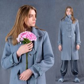
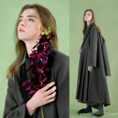
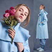
| DESIGN NAME: Rebirth PRIMARY FUNCTION: Womenswear Collection INSPIRATION: If winter comes, can spring be far behind? It is my favorite line from Shelley’s famous poet Ode to the West Wind. Winter is usually considered as a dull and faded period. Plants wither and decompose. Unlike flourish spring, winter might be a boring season with less vigor and vitality. However, I believe there is power of life and energy hidden behind the winter season, inside the branches, or beneath the ice and snow. This time, I wanted to reveal and share the lively spirit of this low-key season with stylish tones. Winter should not be associated with decline. It is the hope of dawn and rebirth of a year. UNIQUE PROPERTIES / PROJECT DESCRIPTION: Less is more, the key idea of Minimalist design, is the core concept of this collection. The main idea is to keep everything simple by taking advantage of simple silhouettes and clean garment outlines. Simple silhouettes generate fresh and cool visual appearance. Slightly exaggerated and asymmetric structures add highlights to the looks. Oversized details, such as big sized buttons, enlarged Velcro loop closures, and hems with extra length, help create visual tension to the pieces. Colors are selected from low saturated greyish tomes which can neutralize color temperatures to provide more gentle, easy and graceful feeling for the looks. OPERATION / FLOW / INTERACTION: The purpose of this collection is to appreciate the beautiful spirit of the winter season. Winter is a low key season which may not be as flourish as spring, as passionate as summer, or as colorful as fall. If comparing a year to one of our common regular day, winter may be the cleaning and showering time before bed. We clean off dust and dirt, remove makeups, change to pajamas and lay in bed. For sure it is the end of a day, but this may also be the most pleasant and restful moment of the day. No need to dress up carefully and work hard to please the others. At this moment, we can appreciate our true selves without worries. As a designer, I wish all wearers can feel comfortable to express their own aesthetics and feel good about themselves when wearing these garments. Oversized structures and asymmetric details increase the wearers’ interest and creativity of the looks. Morandi tonal colors make the garments easier to match and therefore generate more flexibility for the styles. Winter is like our true selves. We are all born simple but unique and special. PROJECT DURATION AND LOCATION: The project started in July 2018 and completed in December 2018 in Shenzhen China, and was launched and presented during the Vancouver Fashion Week in March 2019, in Vancouver, Canada. FITS BEST INTO CATEGORY: Fashion, Apparel and Garment Design |
PRODUCTION / REALIZATION TECHNOLOGY: Basic materials of this collection included regular knit jersey, Lycra, cashmere and woolen fabrics. Oversized structures and distinct details such as exaggerated collars, asymmetric pleats and special Velcro loop closures generated visual impact for the looks. The Morandi color palette created a neutral gentle temperature for the environment. These are a group of low saturated colors with greyish tones. Unlike bright and high saturated colors, they can easily mix and match with each other. By applying Morandi colors to the designs, the wearers will have more flexibility in choosing and matching pieces with different colors, and therefore allowing more freedom in creating their own unique personal styles. SPECIFICATIONS / TECHNICAL PROPERTIES: All garments are made in size M, but slightly oversized. TAGS: Jessture, womenswear, outerwear, fashion, fashion design, apparel, garment, coat, winter coats RESEARCH ABSTRACT: Color theory and color psychology are always important components of design technique. For this collection, color systems are carefully studied and selected based on the Morandi color Palette. Low saturated colors could fit in the winter atmosphere well. And the quality of high compatibility makes the Morandi colors easier to blend in with each other. Since the collection follows the key idea of minimalist, instead of structurally layering up the pieces, I decided to use same tonal colors with different shades in the same pieces as well as in a complete look. Those tonal shades can improve layer depth and stereovision of the garments spontaneously. In this way, the garments can keep their simple and neat silhouettes, while those tonal shades and colors work on creating layers and visual tension for the looks at the same time. CHALLENGE: In order to follow the principle of minimalist, I tried to keep everything as simple as possible without diminishing the aesthetic property and quality of the garments. The challenge was how to make simple silhouettes attractive. If not by applying complex layers or structures, color selection would be a proper solution in this case. If the Morandi color palette pictured a beautiful clear ice field, then it was the monotone color matching system that built up layers of snow and icebergs for the picture of winter wonderland. ADDED DATE: 2021-06-20 15:25:37 TEAM MEMBERS (1) : IMAGE CREDITS: Image #1: Photographer Thirteen Studio, Model Nelli, 2019 Image #2: Photographer Thirteen Studio, Model Nelli, 2019 Image #3: Photographer Thirteen Studio, Model Nelli, 2019 Image #4: Photographer Thirteen Studio, Model Nelli, 2019 Image #5: Photographer Thirteen Studio, Model Nelli, 2019 |
||||
| Visit the following page to learn more: https://www.jesstureny.com | |||||
| AWARD DETAILS | |
 |
Rebirth Womenswear Collection by Jessica Zhengjia Hu is Winner in Fashion, Apparel and Garment Design Category, 2021 - 2022.· Read the interview with designer Jessica Zhengjia Hu for design Rebirth here.· Press Members: Login or Register to request an exclusive interview with Jessica Zhengjia Hu. · Click here to register inorder to view the profile and other works by Jessica Zhengjia Hu. |
| SOCIAL |
| + Add to Likes / Favorites | Send to My Email | Comment | Testimonials | View Press-Release | Press Kit | Translations |
| COMMENTS | ||||||||||||
|
||||||||||||
Did you like Jessica Zhengjia Hu's Fashion Design?
You will most likely enjoy other award winning fashion design as well.
Click here to view more Award Winning Fashion Design.


