DESIGN NAME:
M and W
PRIMARY FUNCTION:
Residence
INSPIRATION:
The design is inspired by the love for the natural scenery of the mountains, through the modern expression technique, combined with the ups and downs of the mezzanine space, it traces the ridges of the mountains and makes the occupants explorers in the mountains and streams. Even in a limited number of acres, you can still feel the fresh and wild nature of reason and gentleness, and retain the heart of loving life and nature.
UNIQUE PROPERTIES / PROJECT DESCRIPTION:
In the 43 square meters split level space, under the framework of extreme functional requirements, the elevation characteristics of the split level space and the flat elevation openings in various dimensions are used to guide the multi faceted relationship between each space and maximize the utilization of the floor effect. At the same time, it preserves natural lighting and extends the number of visual acres to the maximum.
OPERATION / FLOW / INTERACTION:
In the multi layered space with high and low drops, the homeowner is like a mountaineering explorer, discovering different scenery and moods at every turn of the peaks and different angles of vision. When alone, you can work and exercise in the multifunctional study room, or read a book in the reading area beside the bed. The stairs become a platform to look at the outdoor scenery, and get along with the soul comfortably in the mountains and forests. When family and friends pay a visit, you can cook and share meals in the kitchen, or lean on the rock stairs to talk and interact freely.
PROJECT DURATION AND LOCATION:
The project started and finished in August 2020 in Taiwan.
FITS BEST INTO CATEGORY:
Interior Space and Exhibition Design
|
PRODUCTION / REALIZATION TECHNOLOGY:
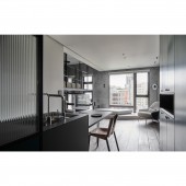
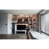
At the entrance, the porch and the kitchen are separated by glass and mirror composite screens to divert the moving lines and retain the flow of light, which brings the aesthetic effect of virtual and real. The low entrance hallway is set like a crack in the rock and combined with light, highlighting the open and bright feeling of the main living space. The original layout has a height difference between the living room and the study. In response to the needs of use, we set up a mezzanine above the study, so that the levels of the public and private areas can be distinguished, just like the different stages of the mountain. The rotating TV wall uses dynamic functionality to make the boundary between the study and the living room ambiguous, forming an open and coherent view.
SPECIFICATIONS / TECHNICAL PROPERTIES:
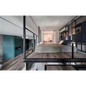
The bedroom on the mezzanine floor is located on the overhanging rock block of the mountain. The two sides are separated by transparent glass and hollow, and the dressing room becomes the opposite mountain. The hollowed out iron staircase and the study room in the descending area are mainly indigo blue, describing waterfalls and quiet deep pools. The details of the iron structure are wrapped in leather, and they are parasitic vines between the mountain trails. When the user walks between the steps, the bird lights on the patio, as if being disturbed by the explorers visit, fly lightly and gracefully between the valleys. The gray volume extending from the stairs to the study room is cut diagonally at one end of the desk to make the rock more organic, like the edges and corners polished by natural changes. In addition, we also use special paints on the TV wall and a dining table with brushed and mottled colors to simulate the erosion of minerals in the stream and the color gradation. The specially treated wooden floor will show different color changes over time and daily use.
TAGS:
Interior, Design, House, Residence
RESEARCH ABSTRACT:
The porch and the kitchen are divided by composite material screens to create the beauty of light and shadow between the virtual and the reality. The low porch combines the image of cracks in the rock with light to highlight the openness of the main space. We set up a mezzanine above the study room to distinguish the hierarchy between the public and private areas, while the rotating TV wall ambiguities the boundaries to form spatial continuity. On the other hand, the interlacing of iron pieces introduces a sense of cleanliness of modern style. We also separate the two sides of the mezzanine from the wall to create the image of the mountains and rocks hanging and facing each other. The bottom steps connect the living room and study room with a gray platform. They are like huge rock masses, and serve as a viewing platform and seating area in the living room. In the study, it functions as a desk.
CHALLENGE:
Because the indoor space is only 43 square meters, it is necessary to think about the expansion of the future life for single homeowner. How to put all the functions in a limited space and retain the open and penetrating visual experience is a problem that needs to be considered in this case.
ADDED DATE:
2021-06-14 04:19:44
TEAM MEMBERS (1) :
Kao Shih Chieh
IMAGE CREDITS:
Hey! Chesse
|


