Aesthetics of Calibration Glasses Store by Clement Tung Jeun Cheng |
Home > Winners > #126614 |
 |
|
||||
| DESIGN DETAILS | |||||
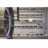
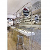
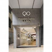
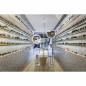
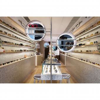
| DESIGN NAME: Aesthetics of Calibration PRIMARY FUNCTION: Glasses Store INSPIRATION: Treasure what is offered by nature via the approach of being the designer, to allow people and the environment to live sustainably with a friendlier approach. UNIQUE PROPERTIES / PROJECT DESCRIPTION: This project is a glasses store forfeiting the old-style glasses store type with a brand new design, thereby creating a bright and professional commercial space with open-style design as the main body, utilizing the central island bar chair design to shorten the distance between the customers, employees and products, thereby allowing for more relaxed communication without the restriction of distance. OPERATION / FLOW / INTERACTION: The visual space is extended via the use of the bevel design by the entrance as well as the lines of the walls on both sides, with circulation which is designed to attract customers to go inside the store; moreover, all products are displayed above the waist height to allow reducing compressed visual sentiment while further adding in rhythmic long and short planks, resembling the long and short markings on the calibration, allowing the product arrangement with variation and separation without influencing the overall spatial harmony, it is a spatial design filled with ingenious ideas which combine with the product characteristics. PROJECT DURATION AND LOCATION: The project finished in July 2020, Macau. FITS BEST INTO CATEGORY: Interior Space and Exhibition Design |
PRODUCTION / REALIZATION TECHNOLOGY: As for the materials, the combination of wood patterns with waterstone endows the space with a dignified yet refreshing visual effect, which is decorated with stainless steel that corresponds to the metallic material of the glasses, further bringing out the professional and fashionable ambience. Moreover, due to the long and narrow shape of the spatial layout, the circulation and area segmentation are limited, where an open sentiment is required to be presented in the limited space while offering strong storage function in order to display the numerous branded product models. SPECIFICATIONS / TECHNICAL PROPERTIES: The property is about 30.3 square meters. TAGS: Interior Design, Glasses Store, Waterstone, Stainless steel, Modern style RESEARCH ABSTRACT: All products are displayed above the waist height to allow for more focused and clear visual effect, thereby reducing compressed visual sentiment while further adding in rhythmic long and short planks, resembling the long and short markings on the calibration, allowing the product arrangement with variation and separation without influencing the overall spatial harmony, it is a spatial design filled with ingenious ideas which combine with the product characteristics. CHALLENGE: The position of the entrance is elevated, allowing sunlight to result in a greater shining angle, thereby enhancing indoor lighting; LED lights are selected for the light fixture to save energy, while eco-friendly wallpapers are adopted to reduce the burden on the environment; with the building structural technology, natural ventilation and natural lighting are further emphasized to enhance the indoor degree of comfort, thereby satisfying the indoor lighting demand. ADDED DATE: 2021-06-08 09:34:29 TEAM MEMBERS (1) : Director: Clement Tung Jeun Cheng IMAGE CREDITS: Photo credit: Billy Yiu |
||||
| Visit the following page to learn more: http://www.cinchstudio.mo | |||||
| AWARD DETAILS | |
 |
Aesthetics of Calibration Glasses Store by Clement Tung Jeun Cheng is Winner in Interior Space and Exhibition Design Category, 2021 - 2022.· Read the interview with designer Clement Tung Jeun Cheng for design Aesthetics of Calibration here.· Press Members: Login or Register to request an exclusive interview with Clement Tung Jeun Cheng. · Click here to register inorder to view the profile and other works by Clement Tung Jeun Cheng. |
| SOCIAL |
| + Add to Likes / Favorites | Send to My Email | Comment | Testimonials | View Press-Release | Press Kit |
Did you like Clement Tung Jeun Cheng's Interior Design?
You will most likely enjoy other award winning interior design as well.
Click here to view more Award Winning Interior Design.


