DESIGN NAME:
Wagyu Let’s Shabu
PRIMARY FUNCTION:
Hot Pot
INSPIRATION:
We uses white square lights to connect spaces within the restaurant. Introduction (white color), continue with (Japanese fan pattern), transition (Bar- white color+ pattern) and summing up (light spots).
UNIQUE PROPERTIES / PROJECT DESCRIPTION:
The space design of this project combines traditional Japanese techniques with novel Japanese presentation, fusing historical and cultural features of the old city with the vitality of the new space, inspires the sparkle between traditional and modern Japanese representations, and creates different experiences and imaginations from different viewing directions.
OPERATION / FLOW / INTERACTION:
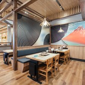
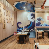
In the restaurant, wooden grille and white square lights matched with Japanese fan pattern were used to divide the spaces, and to connect with the next key space-self-service BAR: using traditional Japanese wooden structure and the new Japanese style lights with the brand’s Japanese symbol as the focus of this area. The wall demonstrating the core spirits of the brand- a squad of Japanese warriors, each symbolizes a type of food. These brand image characters were made vividly by light differences. Small spaces are decorated with large-scale fan-shaped iron pieces and ocean wave decorations, which creates scenes in the space, representing the overall rhythm and imagination of a story.
PROJECT DURATION AND LOCATION:
The project started in December 2020 and finished in March 2021 in Tainan.
FITS BEST INTO CATEGORY:
Interior Space and Exhibition Design
|
PRODUCTION / REALIZATION TECHNOLOGY:
Carpenter Work/ Vinyl Tile/ Decorative Lighting
SPECIFICATIONS / TECHNICAL PROPERTIES:
Seating area 392.06788 sq. meter/ Kitchen 86.28138 sq. meter/ Toilet 21.81828 sq. meter/ Others 15.86784 sq. meter
TAGS:
Wagyu, Japanese Warriors, Japanese Symbol
RESEARCH ABSTRACT:
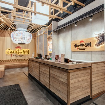
In the arcade and indoor waiting area, we use wooden grille and square lamp shades to emphasize the overall brand recognition. The two main visual focuses, one is the wooden circular interweaving grille and the brand image- the big lantern, and the other is the rough diatomite background with the Japanese-style large sign curtain, are designed to emphasize the brand power - Japanese beef prepared in 3 ways while demonstrating the contemporary Japanese elements.
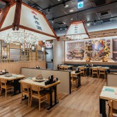
In the restaurant, wooden grille and white square lights matched with Japanese fan pattern were used to divide the spaces, and to connect with the next key space-self-service BAR: using traditional Japanese wooden structure and the new Japanese style lights with the brand’s Japanese symbol as the focus of this area. The wall demonstrating the core spirits of the brand- a squad of Japanese warriors, each symbolizes a type of food. These brand image characters were made vividly by light differences. Small spaces are decorated with large-scale fan-shaped iron pieces and ocean wave decorations, which creates scenes in the space, representing the overall rhythm and imagination of a story.
In the back area, the giant Japanese-style wooden lamp descend from above, forming the two layer spatial effects under the lamp- giving continuity of the light spot to surround the brand character in this area-Commander Wagyu and the core spirit wall symbols. The visual depth of this area is produced by stacked layers extended to the ceiling.
CHALLENGE:
1. As the base is darker, in order to build up the eye-catching level, we use the Japanese-style white square lights as the designing strategy to link the arcade, the entrance and the front desk counter area.
2. The brand image is a big lantern. The thinking behind this is to create an overall visual impression through the combination of the transformed lines and shapes inspired by Japanese grille and lantern.
3. In response to the expectation of the new Japanese style, we proposed to connect the waiting area and the guest seating area with the Japanese-style white square lights, aiming to create a lively Japanese atmosphere between different areas in the restaurant.
ADDED DATE:
2021-03-29 06:38:55
TEAM MEMBERS (1) :
Designed by Hao Ching Shan/ FK Create Space Design Decoration Company
IMAGE CREDITS:
Hao Ching Shen, 2020.
|
