Maison Francois Restaurant by John Whelan - GSL |
Home > Winners > #123843 |
 |
|
||||
| DESIGN DETAILS | |||||
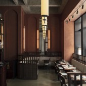
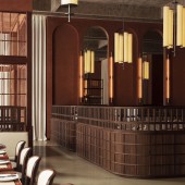
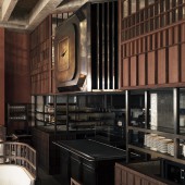
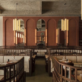
| DESIGN NAME: Maison Francois PRIMARY FUNCTION: Restaurant INSPIRATION: Rather than taking the more tried and tested route of looking to the Art Deco period for inspiration, the design looked at successful residential conversions of Brutalist spaces, such as Ricardo Bofill’s, La Fabrica. What interested the team was how the designers managed to create a sense of intimacy and warmth despite their imposing concrete surrounds. The solution was to find the right dosage of these ideas, within a more traditional brasserie framework. UNIQUE PROPERTIES / PROJECT DESCRIPTION: Initially, the concrete shell was taken as the starting point, creating a Brutalist ceiling coffering and laying down a polished concrete floor. Once the framework was established, ensuing elements were designed to create that elusive warmth and intimacy. Curved walnut banquettes with privacy glass uppers are upholstered in a resistant cream linen that are tactile and inviting. They correspond with floor-to-ceiling cream linen curtains that offset the grandeur of the imposing terracotta stucco and mirror arches. OPERATION / FLOW / INTERACTION: Bringing the kitchen into direct conversation with the room was key to creating a vibrant atmosphere, and so the central island pass became the focal point of the room. It sits underneath a monumental Rado inspired clock flanked by a lambs-tongue mahogany and bevelled mirror canopy that recalls the windows of the Ismaili Centre. Metals range from patinated nickel to burnished brass, all heavy on texture and designed to warm up the space. PROJECT DURATION AND LOCATION: The project started in September 2019 and opened in September 2020 |
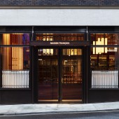
PRODUCTION / REALIZATION TECHNOLOGY: The coffered ceiling was realised in phonic material and painted in faux-cement to match the polished concrete floor. Joinery is in walnut and mahogany, with patinated brass and nickel metalwork. Upholstery and drapery is in cream linen. SPECIFICATIONS / TECHNICAL PROPERTIES: 500 square metres floor space TAGS: Restaurant, Brasserie, London RESEARCH ABSTRACT: Much of the research that went into this project had been conducted over several years, working on restoring and re-designing historic brasseries in France. Everything that was learned by the studio during this period was applied to the project, but this knowledge was infused with more contemporary reference points such as Postmodernism and Brutalism in order to evolve the genre. CHALLENGE: The main challenge was the space that was inherited from the landlord. A far cry from the warm and welcoming environment desired by the client, it was a cavernous concrete shell with no discernible features of interest. The façade offered little more by way of inspiration, being part of a somewhat generic new build. It was therefore necessary to think carefully about how the large volume could be animated, and how to create visibility from the street. ADDED DATE: 2021-03-25 08:23:32 TEAM MEMBERS (1) : Designer: John Whelan for The Guild of Saint Luke IMAGE CREDITS: Photography by Oskar Proctor |
||||
| Visit the following page to learn more: https://www.gsl.works | |||||
| AWARD DETAILS | |
 |
Maison Francois Restaurant by John Whelan-Gsl is Winner in Hospitality, Recreation, Travel and Tourism Design Category, 2020 - 2021.· Read the interview with designer John Whelan - GSL for design Maison Francois here.· Press Members: Login or Register to request an exclusive interview with John Whelan - GSL. · Click here to register inorder to view the profile and other works by John Whelan - GSL. |
| SOCIAL |
| + Add to Likes / Favorites | Send to My Email | Comment | Testimonials | View Press-Release | Press Kit |
Did you like John Whelan-Gsl's Hospitality Design?
You will most likely enjoy other award winning hospitality design as well.
Click here to view more Award Winning Hospitality Design.


