W Plus Hair Salon by Millton Yu |
Home > Winners > #123730 |
 |
|
||||
| DESIGN DETAILS | |||||
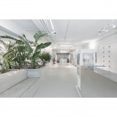
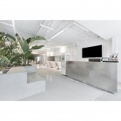
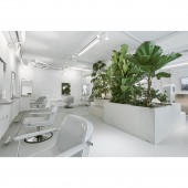
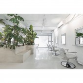
| DESIGN NAME: W Plus PRIMARY FUNCTION: Hair Salon INSPIRATION: Haircut is a homonym of subtraction in Mandarin, and this brings out the design concept for this project- subtracting what is unnecessary to give a new look with a beautiful addition relationship. The W Plus Salon space emphasizes the evolution from subtraction to addition, fully elucidating its new brands spirit after its nine years in brewing. UNIQUE PROPERTIES / PROJECT DESCRIPTION: W Plus Salon is hidden in a residential alley in the east district of Taipei. With Lab Garden as their design concept, three progressive layers of areas are planned to express spatial appeals, furnishing a sophisticated indoor experience of lavishness. OPERATION / FLOW / INTERACTION: There is no obvious boundary in the space; however, each area is individual but connective harmoniously at the same time, presenting a conceptual experimental space. The space is not only for hair salon, but for exhibition, presentation, party, lecture, or anything that can take place in it. PROJECT DURATION AND LOCATION: The project finished in June 2020 in Taipei, Taiwan. FITS BEST INTO CATEGORY: Interior Space and Exhibition Design |
PRODUCTION / REALIZATION TECHNOLOGY: A floor-to-ceiling glass curtain is used for the exterior walls of the salon. The interactions between indoor and outdoor sceneries create a broad, boundless view. When people walk into the entrance, they are greeted with an indoor green garden on a concrete platform. The concrete platform hides the cultivating sight with a sense of natural penetration. There is also a cement wall screen serving as a room divider, and that wall is filled with round holes, creating a penetrating and enticing view through the holes. SPECIFICATIONS / TECHNICAL PROPERTIES: The project is 196 square meter. TAGS: Hair Salon, Commercial, Interior Design, Space, W Plus RESEARCH ABSTRACT: Everything in the entire space spreads a slightly cool color, with the flooring and the concrete platform having a consistent grey and rough texture, the reception counter and stainless steel work-surface with a cold grey tone, echoing the cold white lighting and the geometric mirror on the wall. The floating plant area scattered at the outdoor balcony is paved with abandoned cement pipes, sand, and gravel, while indoor materials are mostly made of recycled and renewed products. CHALLENGE: The experimental spatial concept conveys the philosophy of the client, W Plus Salon, which is to make the space continuously improve, and to prompt the borders of different fields to vanish and then stimulate the new possibility. ADDED DATE: 2021-03-22 01:59:25 TEAM MEMBERS (1) : Designer: Millton Yu IMAGE CREDITS: Image #1-5: Photographer Alvic Han, W Plus, 2020. |
||||
| Visit the following page to learn more: https://www.m-interior-design-m.com | |||||
| AWARD DETAILS | |
 |
W Plus Hair Salon by Millton Yu is Winner in Interior Space and Exhibition Design Category, 2020 - 2021.· Read the interview with designer Millton Yu for design W Plus here.· Press Members: Login or Register to request an exclusive interview with Millton Yu. · Click here to register inorder to view the profile and other works by Millton Yu. |
| SOCIAL |
| + Add to Likes / Favorites | Send to My Email | Comment | Testimonials | View Press-Release | Press Kit |
Did you like Millton Yu's Interior Design?
You will most likely enjoy other award winning interior design as well.
Click here to view more Award Winning Interior Design.


