|
|
|

|
|
| DESIGN DETAILS |
DESIGN NAME:
Tsarsky Reserve
PRIMARY FUNCTION:
Paper Packaging
INSPIRATION:
Knowing the fact that Tsarsky Reserve is the new direction of NESANS Company production, which is only at the start of their success, the key point was to create design that could be easily transfromed on future product without creating new design and difficult expencieve photosession. Ispired by patterns and caleidoscope share this idea on all of the packages. This helped to get one solution for millions of other packages.
UNIQUE PROPERTIES / PROJECT DESCRIPTION:
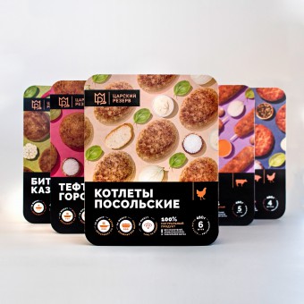
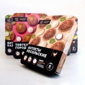
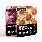
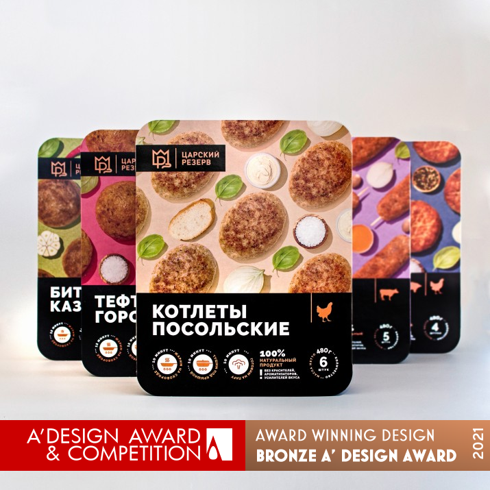
Working on this project the goal was to make bright packages series and avoid traditional way of presenting meat products, which usually includes food on the plate. In addition to this there should be ground for package development. After trying several approaches and composition, was found a solution with the pattern. This became the main idea for all series and also created perfect base for any other products and additional marketing material.
OPERATION / FLOW / INTERACTION:
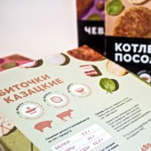
This packaging should work well due to the non-standard presentation of products using patterns and bright color spots. The black block with text information and icons supports the overall attractive composition. Icons (such as chicken, cow and pig) of main using meat type help to navigate with ingredients of the product. Big bright icon with procents of real meat focuses on naturalness. All of mentioned fact should help to increase the value of the product.
PROJECT DURATION AND LOCATION:
Project start: June 2020
Project end: September 2020
Designer location: Berdyansk, Ukraine
Client location: Moscow, Russia
FITS BEST INTO CATEGORY:
Packaging Design
|
PRODUCTION / REALIZATION TECHNOLOGY:
Used foldable paper package which is fitted (wrapped) on plastic box with product inside.
SPECIFICATIONS / TECHNICAL PROPERTIES:
One size for all packages width 180 mm x Depth 45 mm x Height 226 mm
TAGS:
meat, pattern, bright, caleidoscope, food, meatballs, russian cuisine
RESEARCH ABSTRACT:
Because of extermely short terms deep research was not carried out. The key point was to redesign available label which was made in very low design quality according to company growth. Client's wishes were to increase product price with design improvement.
CHALLENGE:
Tsarsky Reserve is not only food company but they also focused on souvenir production. That is why the goal was to design logo for two branches. The most difficult part of work was to find simple solution to produce package series in future withou spending lots of money on design and photosession. That should be something special, unusual and bright. Something that could help product look more attractive.
ADDED DATE:
2021-03-07 16:21:48
TEAM MEMBERS (2) :
Design: Natalya Bilousova and Marketing Director: Anton Rubtsov
IMAGE CREDITS:
All of the separate images are given by client
PATENTS/COPYRIGHTS:
Trademark 2021. Trademark Holder NESANS Company
|
|
| CLIENT/STUDIO/BRAND DETAILS |
 |
NAME:
Tsarsky Reserve
PROFILE:
Company founded at the end of 2000. For 20 years we have been successfully working and developing various types of activities. Among our areas, the leading one is the production of packaging goods and the production of frozen semi-finished products. Also we are engaged in warehouse, rental and management activities.
|
|
|
| COMMENTS |
| Giulia Esposito |
Comment #14063 on December 27, 2022, 5:46 pm |
|
I absolutely love "Tsarsky Reserve" Paper Packaging Design by Natalya Bilousova! This design is truly stunning and it is amazing how much detail and creativity was put into it. The colors, patterns, and textures all work together to create a beautiful and unique packaging that stands out from the rest. The artwork on the packaging is also very eye-catching and would draw in potential customers. Overall, Natalya Bilousova has created an amazing packaging design that is sure to make a statement. Congratulations to Natalya Bilousova for winning the A' Design Award for this work!
|
| Adam Harris |
Comment #82879 on January 4, 2023, 9:45 am |
|
I am absolutely in awe of the work titled "Tsarsky Reserve"; it is truly a remarkable example of good design. The goal to create bright packages series, avoid traditional way of presenting meat products, and have a pattern-based design that could be easily transformed on future product without creating new design and expensive photo session is remarkable. The attention to detail and the creativity in the design is truly inspiring. Congratulations to the designer for winning the A' Design Award, a testament to their skill and creativity!
|
| Elisabeth Clark |
Comment #92439 on January 4, 2023, 7:11 pm |
|
I’m in awe of the creative and aesthetically pleasing packaging design Natalya Bilousova has created for Tsarsky Reserve. The unique pattern used to create the packaging is eye-catching and perfect for the product. It is inspiring to see how Natalya was able to create a design that is easily transformable to other products and marketing materials. The research and dedication that went into this project is evident in its end result. I am so impressed with Natalya’s work, and it’s no surprise that the design was recognized with the A' Design Award. It is a fantastic example of how design can elevate a product and create a memorable experience for the customer. Congratulations on such a well-deserved award.
|
|
|
Did you like Natalya Bilousova's Packaging Design?
You will most likely enjoy other award winning packaging design as well.
Click here to view more Award Winning Packaging Design.
Did you like Tsarsky Reserve Paper Packaging? Help us create a global awareness for good packaging design worldwide. Show your support for Natalya Bilousova, the creator of great packaging design by gifting them a nomination ticket so that we could promote more of their great packaging design works.
|
|

|
|
|
|
