Baltija Chocolate Collection Confectionery Packaging by Bold Brands |
Home > Winners > #122959 |
 |
|
||||
| DESIGN DETAILS | |||||
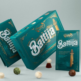
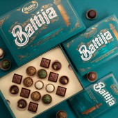
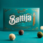
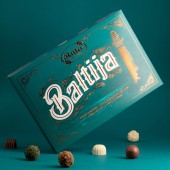
| DESIGN NAME: Baltija Chocolate Collection PRIMARY FUNCTION: Confectionery Packaging INSPIRATION: Confectionery name Baltija came from name of the Baltic Sea in lithuanian. The sea was the main inspiration of this project. It is neighbouring 8 countries, which are all different. Sea is calm and do not carry its own identity as such. That is why the lighthouse was selected as the main symbol of the packaging. Sea also was the inspiration when picking colour. Deep greenish blue colour gave vibrance and luxury feel letting it stand out in the context of confectionery packaging all over the balt UNIQUE PROPERTIES / PROJECT DESCRIPTION: All countries that are bound to baltic sea are unique in their own way. That is why no specific graphic elements were used that would indicate on country or another. Design was thought to be as timeless as possible so classic victorian style illustration were created. This style is full of wavy and dynamic forms that resembles sea movement and volatility. Background contains unique sea scenery together with lighthouse in the foreground connecting it all together. OPERATION / FLOW / INTERACTION: Three separate packages were created for this product line. One of the boxes containing more than fifty candies plastic usage was reduced and paper separations were introduced. Fifteen candy box was decorated with uncommon type of cover giving overall packaging more elegance. To extend same visual experience chocolate bar was packed in carton envelope containing the same graphics. PROJECT DURATION AND LOCATION: This project started in January 2020 February and finished 2020 May FITS BEST INTO CATEGORY: Packaging Design |
PRODUCTION / REALIZATION TECHNOLOGY: All packagings were printed with offset technology, enriched with matte varnish and copper foil elements. SPECIFICATIONS / TECHNICAL PROPERTIES: All boxes and envelopes was made from paper, offset printing with matte varnish and copper foil elements. TAGS: Baltija, Chocolate collection. Chocolate, Chocolate packaging RESEARCH ABSTRACT: One of the most important task was to determine the consumer of the product. Research revealed that oftentimes it is bought as a souvenir from the baltic region. This gave an insight that it should not be associated with one country and it also should communicate the Baltic sea more than box contents. Appearance is really important part of package which is intended to be the gift. Extreme attentions was given to details as well as overall package aesthetics to trigger positive emotion to the end user. CHALLENGE: Biggest challenge was to find symbol that would be unifying throughout the Baltic region, find the target audience and how the product is consumed. With this criteria in mind big challenge was to pick the right subtle and yet luxury style for the graphics which would also has to be timeless and very different from the competition. ADDED DATE: 2021-03-05 14:16:26 TEAM MEMBERS (4) : Creative Director: Motiejus Gaigalas, Head Of Design: Vytenis Petrusevicius, Graphic Design: Vytenis Petrusevicius, Zydrunas Slajus and Illustrator: Zydrunas Slajus IMAGE CREDITS: Photography: Motiejus Gaigalas, Zydrunas Slajus |
||||
| Visit the following page to learn more: http://www.boldbrandsagency.com | |||||
| AWARD DETAILS | |
 |
Baltija Chocolate Collection Confectionery Packaging by Bold Brands is Winner in Packaging Design Category, 2020 - 2021.· Read the interview with designer Bold Brands for design Baltija Chocolate Collection here.· Press Members: Login or Register to request an exclusive interview with Bold Brands. · Click here to register inorder to view the profile and other works by Bold Brands. |
| SOCIAL |
| + Add to Likes / Favorites | Send to My Email | Comment | Testimonials | View Press-Release | Press Kit |
Did you like Bold Brands' Packaging Design?
You will most likely enjoy other award winning packaging design as well.
Click here to view more Award Winning Packaging Design.


