Ripple School Library by Design Action |
Home > Winners > #120466 |
 |
|
||||
| DESIGN DETAILS | |||||
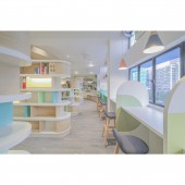
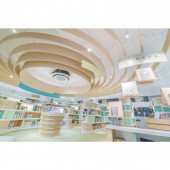
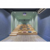
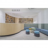
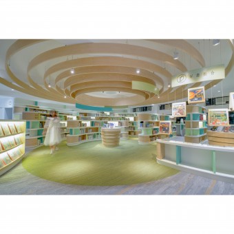
| DESIGN NAME: Ripple PRIMARY FUNCTION: School Library INSPIRATION: Drops falling onto lake cause ripples, as if people acquire knowledge from books, transform information to inspiration by pondering over and over again, ultimately turn into brilliant interpretation. Curved bookshelves together with round shaped table in the center of the library become overlapping ripples, coupled with the pattern on floor and ceiling which are corresponding to each other, making the overall decoration consistent and complete. UNIQUE PROPERTIES / PROJECT DESCRIPTION: The project is under direct subsidy scheme secondary school instituted by government; campus has been worn out over 35 years and associated with problems such as low usage rate of library. In view of this, the designer hopes to beautify the premises and refurbish existing library with warm atmosphere, thereby achieving effective passing on of knowledge, inspiring students and develop a better society for the future. OPERATION / FLOW / INTERACTION: The designer believes that campus is not only a place for learning, but also serves as second home for students. Therefore, a comfortable library is important to give students a sense of belonging. Different level of green are planted in every corner of the library, as if every student is one of a kind with their own expertise. In addition, the light-colored wood elements make the space brighter and closer to nature. PROJECT DURATION AND LOCATION: The project finished in Feb 2020 in Yan Oi Tong Chan Wong Suk Fong Memorial Secondary School, Hong Kong. FITS BEST INTO CATEGORY: Interior Space and Exhibition Design |
PRODUCTION / REALIZATION TECHNOLOGY: Plastic laminate, Carpet, Vinyl tile, Sound reduction fabric, Stone, Corian SPECIFICATIONS / TECHNICAL PROPERTIES: 2500 Sq.ft TAGS: Library, School, Education, Ripple, Secondary School, Design Action, Yan Oi Tong Chan Wong Suk Fong Memorial Secondary School RESEARCH ABSTRACT: Aesthetic education is rare in Hong Kong. Most of the schools were built by government under mass production; their design and floor plan were based on the sample cases that have been circulating for decades, which made the campus look tedious and similar to each other. We believe that the establishment of aesthetics is needed from an early age. A relaxing and comfortable campus can improve students’ interest in learning, inspire their development and build a better society for the future. CHALLENGE: Most of the libraries floor plans, bookshelves and counters design are relatively simple and straightforward. Nevertheless, in the limited space, the designer boldly takes the arc as core factor, curved bookshelves are used to separate different area, so that students can enjoy the process of finding books. Arc design maximizes the visual space, making the original small and boring library become a lively and dynamic self-directed learning space. ADDED DATE: 2021-02-25 12:17:17 TEAM MEMBERS (2) : Creative Director: Vincent Li and Designer: Mancy Li IMAGE CREDITS: Design Action PATENTS/COPYRIGHTS: Design Action |
||||
| Visit the following page to learn more: http://designaction.com.hk/ | |||||
| AWARD DETAILS | |
 |
Ripple School Library by Design Action is Winner in Interior Space and Exhibition Design Category, 2020 - 2021.· Read the interview with designer Design Action for design Ripple here.· Press Members: Login or Register to request an exclusive interview with Design Action. · Click here to register inorder to view the profile and other works by Design Action. |
| SOCIAL |
| + Add to Likes / Favorites | Send to My Email | Comment | Testimonials | View Press-Release | Press Kit |
Did you like Design Action's Interior Design?
You will most likely enjoy other award winning interior design as well.
Click here to view more Award Winning Interior Design.


