Hogoso Studio Office by Qinwei Hu |
Home > Winners > #119990 |
| CLIENT/STUDIO/BRAND DETAILS | |
 |
NAME: Hogoso Design PROFILE: Hogoso Design was established in 2013, formed by a passionate young team. It is a growing and thinking company. The company has strong cohesion and centripetal, has a good professional quality and service awareness, can survey the overall situation, analyze and think about problems from the perspective of development, accurately grasp market positioning, use overall awareness to guide design, and design quality Promote the value of the product, achieve "into it, beyond", to achieve the best integration of development concepts and design ideas. The company's main business scope includes interior decoration and design. The design stage covers conceptual design, schematic design, preliminary design, construction drawing design, and project landing. The company's design team has excellent professional skills and rigorous working attitude, and has shown great enthusiasm and unparalleled sense of responsibility throughout the design process. After several years of unity, cooperation and hard work, it has gained a certain reputation in Ningbo area, and has been expanding its market share and social awareness in the increasingly fierce competition. |
| AWARD DETAILS | |
 |
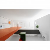
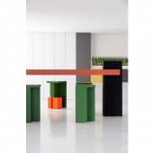
Hogoso Studio Office by Qinwei Hu is Winner in Interior Space and Exhibition Design Category, 2020 - 2021.· Read the interview with designer Qinwei Hu for design Hogoso Studio here.· Press Members: Login or Register to request an exclusive interview with Qinwei Hu. · Click here to register inorder to view the profile and other works by Qinwei Hu. |
| SOCIAL |
| + Add to Likes / Favorites | Send to My Email | Comment | Testimonials | View Press-Release | Press Kit |
Did you like Qinwei Hu's Interior Design?
You will most likely enjoy other award winning interior design as well.
Click here to view more Award Winning Interior Design.


