Alienergy Electrolyte Water Functional Beverages by Genki Forest |
Home > Winners > #119775 |
 |
|
||||
| DESIGN DETAILS | |||||
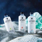
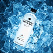
| DESIGN NAME: Alienergy Electrolyte Water PRIMARY FUNCTION: Functional Beverages INSPIRATION: Since the primary function of the Alienergy Electrolyte Water is to refresh and hydrate, the inspiration of the visual design is water. The straight clean-cut bottle shape, the semi-transparent body print material, and the negative space proportion all serve to compose a modern, sporty, and fresh design. UNIQUE PROPERTIES / PROJECT DESCRIPTION: Alienergy is a brand that focuses on functional beverages, aiming to serve the need of the ever growing health-conscious population. Unlike the current designs on the market, the Electrolyte Water is designed upon the minimalist philosophy to demonstrate its product concept of healthy, pure, and reviving. Combined with the sugar free, calorie free formula, and clear water body, the customers can be hydrated and refreshed with zero pressure or health concerns. OPERATION / FLOW / INTERACTION: Most functional beverages on shelves today are colorful because they use food colorings for eye catching effects. Our product however, is proudly clear in color with zero food coloring, building more trust in the health conscious customers, more importantly, gives all consumers a refreshing and fruitful hydration experience with no sugar or calorie pressure. PROJECT DURATION AND LOCATION: The project started in June,2020 and completed on November 2020. The design was completed in Beijing, China. The production location is Shanghai, China. FITS BEST INTO CATEGORY: Packaging Design |
PRODUCTION / REALIZATION TECHNOLOGY: The label is designed with semi transparent material showcasing the ultra hydrating and near water features of the electrolyte water. And the material we chose is OPS, a sustainable substitute for PVC. It can not only be recycled for further use, but can also be burned for fuel even after printing. The burning process won't emit any toxic gas, therefore no pollution created. SPECIFICATIONS / TECHNICAL PROPERTIES: Width 65mm x Depth 65mm x Height 185mm TAGS: Branding, Packaging, bottle, 3D, water RESEARCH ABSTRACT: In the current market especially after the pandemic, the trend of health consciousness is rising. We wanted to create a revolutionary product that meets this demand. We conducted surveys both online and offline for the importance of sugar free and the preference of aesthetics in designs after the preliminary stage. Each question were designed to test out our design or unique product features against real competitors in the market side by side, thus be more grounded in our analysis and results. We have more confidence to have science back up our product and packaging design. CHALLENGE: The label design is minimalistic with an abundance of negative space, thus the packaging material is crucial to the final product to convey our design philosophy. How to achieve the semi-transparent effect that showcasing the ultra-hydrating and water features of the electrolyte water is our main challenge during the printing process. Our designer worked together with the factory on location to fine tune the oil percentage of the colors, after numerous tries the final product can show the body and movement of our electrolyte water under the packaging in a subtle way. ADDED DATE: 2021-02-23 10:26:48 TEAM MEMBERS (7) : Creative Direction: Renkun Zhang , Logo type design: Gang Wang, Jiaqi Liu, Logo mark design: Xiaolan Xiao, Packaging design: Xiaolan Xiao, Rui Yang and Prepress: Rui Yang IMAGE CREDITS: Creator: Gang Wang PATENTS/COPYRIGHTS: Label Patent:202030514752.6 , 2020, China. |
||||
| Visit the following page to learn more: http://www.yuanqisenlin.com/ | |||||
| AWARD DETAILS | |
 |
Alienergy Electrolyte Water Functional Beverages by Genki Forest is Winner in Packaging Design Category, 2020 - 2021.· Read the interview with designer Genki Forest for design Alienergy Electrolyte Water here.· Press Members: Login or Register to request an exclusive interview with Genki Forest. · Click here to register inorder to view the profile and other works by Genki Forest. |
| SOCIAL |
| + Add to Likes / Favorites | Send to My Email | Comment | Testimonials | View Press-Release | Press Kit |
Did you like Genki Forest's Packaging Design?
You will most likely enjoy other award winning packaging design as well.
Click here to view more Award Winning Packaging Design.


