Lone Mobile App by Xi He |
Home > Winners > #119630 |
 |
|
||||
| DESIGN DETAILS | |||||
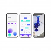
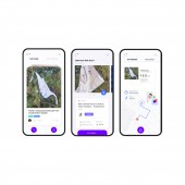
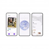
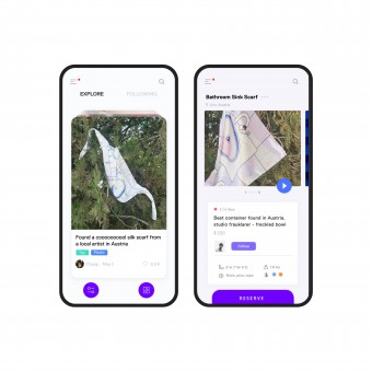
| DESIGN NAME: Lone PRIMARY FUNCTION: Mobile App INSPIRATION: It is hard for people to get to buy all the authentic things over the world, more deeply, it is hard for normal people to really get to know about what is good in the outside world. we all have limited knowledge about the places we've never been; there's a lack of authenticity of products that are available for people while with increasing demand for international shopping, people have a higher willingness to buy authentic, creative products. UNIQUE PROPERTIES / PROJECT DESCRIPTION: Lone is an interactive mobile App introducing a revolutionize E-commerce, by rethinking international shopping, offer users an authentic international social shopping experience, helps customers to buy authentic things from a small boutique or even on the street around the world. With the ecosystem of travelers discover things when they are traveling and post on Lone, buyers looking for authentic items from any store anywhere on our app, Lone shoppers will help connect the dots. OPERATION / FLOW / INTERACTION: The app is functional, simple, and intuitive. But more than anything it aims to deliver a great user experience, with emotionally engaging interaction patterns. There are 3 parts of app users for Lone app. Travelers, buyers, and LONE shoppers. Travelers discover and post product cards in the App, buyers browse product cards posted by travelers, search for products and purchase products. Lone shoppers in that specific area will get the product and ship them to buyers. In this flow, travelers and buyers are the front-end App users, it's easy for users to change roles between traveler and buyer. PROJECT DURATION AND LOCATION: The design process of the project started in Feb 2018 in Rochester, finished in Oct 2020, it is an ongoing journey still with updates and user feedback. |
PRODUCTION / REALIZATION TECHNOLOGY: Lone app utilizes native app technologies, including camera-based features for scan, augmented reality features to show products, and Touch ID to pay. Illustrations were designed in Adobe Illustration, app UI was designed in Sketch and animated with Adobe After Effects. SPECIFICATIONS / TECHNICAL PROPERTIES: Android, iOS TAGS: social shopping, e-commerce, app, interactive design, travel, mobile app, product design, future shopping UX, UI, user-centered, RESEARCH ABSTRACT: A large amount of user research was performed over the course of the project, based on audience mapping, audience analysis, including user surveys, user interviews, A round of user testing, B round of user testing. Each round of user testing had 3 different focus of testing, including naming convention and copy of all screens in the App, user experience and user journey, visual design and color. CHALLENGE: Since the app is aiming to have users across different countries, so the quantity and the geographical mapping of the research samples was a challenge. But it is also a requirement, so the App is able to reach the human-centered design, avoid any confusion and inappropriate visual communication for people from different places in the world. ADDED DATE: 2021-02-22 16:48:03 TEAM MEMBERS (1) : IMAGE CREDITS: Image: Xi He |
||||
| Visit the following page to learn more: https://xihestudio.com/LONE | |||||
| AWARD DETAILS | |
 |
Lone Mobile App by Xi He is Winner in Mobile Technologies, Applications and Software Design Category, 2020 - 2021.· Read the interview with designer Xi He for design Lone here.· Press Members: Login or Register to request an exclusive interview with Xi He. · Click here to register inorder to view the profile and other works by Xi He. |
| SOCIAL |
| + Add to Likes / Favorites | Send to My Email | Comment | Testimonials | View Press-Release | Press Kit |
| COMMENTS | ||||||||||||
|
||||||||||||
Did you like Xi He's Mobile Design?
You will most likely enjoy other award winning mobile design as well.
Click here to view more Award Winning Mobile Design.


