Computer College Exhibition Space by Bennet Marburger and Ji Zhang |
Home > Winners > #119116 |
 |
|
||||
| DESIGN DETAILS | |||||
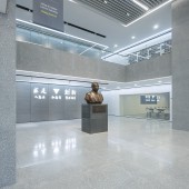
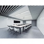
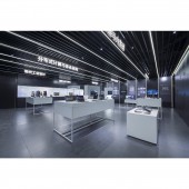
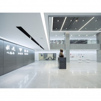
| DESIGN NAME: Computer College PRIMARY FUNCTION: Exhibition Space INSPIRATION: The new appearance of the renovated spaces follows a minimalist approach and is inspired by the technological orientation of the college. A light and a dark design scheme create two very different atmospheres for the rooms. All installations such as exhibition panels, video screens, cabinets and security appliances are integrated into the wall panels. UNIQUE PROPERTIES / PROJECT DESCRIPTION: To celebrate the 40th anniversary of the College of Computer Science and Technology at Zhejiang University, parts of the premises were transformed in order to present the history and latest research achievements of the college. Within the existing buildings a multi-functional exhibition hall, a conference room and a show room with an introduction hall were created. OPERATION / FLOW / INTERACTION: BIM was used throughout the whole design process, in order to combine interior design, furniture planning, exhibition design and lighting design to a holistic overall planning. PROJECT DURATION AND LOCATION: The project started in July 2018 in Hangzhou and finished in November 2018 in Hangzhou. FITS BEST INTO CATEGORY: Interior Space and Exhibition Design |
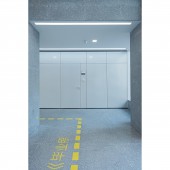
PRODUCTION / REALIZATION TECHNOLOGY: Printed aluminium panels with built-in cabinets, video screens, security appliances / terrazzo / built-in linear LED lights / The lighting design of the show room combines linear LED lights with spots and down-lights, while accents are created by brightly illuminated signage. SPECIFICATIONS / TECHNICAL PROPERTIES: The project area covers a total of 900 square meters. The spaces originally built in the 1990s were reconstructed by the chance of the 40th anniversary of the college. The new rooms include an exhibition hall, a conference room, a show room and other public spaces. TAGS: Interior, Renovation, Exhibition Space, Furniture, Lighting Design, Flat, Modern, Simple, Minimalistic, Futuristic RESEARCH ABSTRACT: For the exhibition hall and the conference room we chose the light design with white metal panels and grey terrazzo. The exhibition with the college’s history was printed directly on the wall panels and has built-in displays. The show room with changing exhibitions follows the dark design scheme. Anthracite metal panels alternate with framing light strips, while screens and exchangeable text panels are installed on the walls. Computers, tablets and other exhibits can be placed on white tables. CHALLENGE: A major challenge of the project was to renovate the spaces while they were still being used. The workers had to proceed step by step and a lot of dust protection was needed. As the exhibition hall was meant to be used as a multi-functional room we decided to integrate all the exhibition information and objects into the wall panels to keep the main area free. The show room also had to be very adaptable so that every year different projects and research results can be presented. So we designed all appliances and installations flexible and demountable. ADDED DATE: 2021-02-19 07:27:17 TEAM MEMBERS (1) : Bennet Marburger, Ji Zhang and Ning Wang IMAGE CREDITS: Image #1: Photographer Shiromio Studio, Exhibition Hall, 2018. Image #2: Photographer Shiromio Studio, Logo Wall, 2018. Image #3: Photographer Shiromio Studio, Corridor, 2018. Image #4: Photographer Shiromio Studio, Conference Room, 2018. Image #5: Photographer Shiromio Studio, Show Room, 2018. PATENTS/COPYRIGHTS: Copyrights belong to 2408 studio for architecture, urban planning and design, 2018. |
||||
| Visit the following page to learn more: http://www.2408.studio | |||||
| AWARD DETAILS | |
 |
Computer College Exhibition Space by Bennet Marburger and Ji Zhang is Winner in Interior Space and Exhibition Design Category, 2020 - 2021.· Read the interview with designer Bennet Marburger and Ji Zhang for design Computer College here.· Press Members: Login or Register to request an exclusive interview with Bennet Marburger and Ji Zhang. · Click here to register inorder to view the profile and other works by Bennet Marburger and Ji Zhang. |
| SOCIAL |
| + Add to Likes / Favorites | Send to My Email | Comment | Testimonials | View Press-Release | Press Kit |
Did you like Bennet Marburger and Ji Zhang's Interior Design?
You will most likely enjoy other award winning interior design as well.
Click here to view more Award Winning Interior Design.


