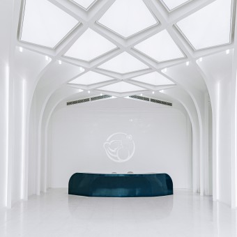
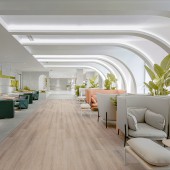
Newme Medical Beauty Hospital by Jiang and Associates Creative Design |
Home > Winners > #119100 |
| CLIENT/STUDIO/BRAND DETAILS | |
 |
NAME: Jiang & Associates Creative Design PROFILE: Jiang & Associates Design (former Frank Jiang Design) is now one of the biggest interior design firms in Asia. As the first interior design firm who listed on the A-share market (300668.SZ), we ranked 25th in the Top 100 giants 2019 of Interior Design magazine, and 3rd in retail design, which is No.1 both in Asia and China. Headquartered in Shenzhen, China, J&A (Jiang & Associates Design) has established its regional branches in Shanghai, Hong Kong, Beijing, Dalian,Wuhan and Xi'an. J&A mainly runs four design areas including commercial complex, healthcare complex, transportation complex, culture and education complex, boasting over 600 international designers from world-famous schools that are specialized in architecture, M&E, sign system, lighting, decoration and intelligent design, with projects covering shopping mall, office, property/hotel, healthcare, public building, transportation and cultural education. For years, J&A has received several hundred of national and international awards as the leader of Chinese urban complex design and have received more than 30 patents. J&A has consistently believed in the development philosophy of China depth with a global vision, remained the close cooperative relationship with renown developers including China Resources, Vanke, Longfor, etc. ,which always provides integrated service of customized design for clients. |
| AWARD DETAILS | |
 |
Newme Medical Beauty Hospital by Jiang and Associates Creative Design is Winner in Interior Space and Exhibition Design Category, 2020 - 2021.· Read the interview with designer Jiang and Associates Creative Design for design Newme here.· Press Members: Login or Register to request an exclusive interview with Jiang and Associates Creative Design. · Click here to register inorder to view the profile and other works by Jiang and Associates Creative Design. |
| SOCIAL |
| + Add to Likes / Favorites | Send to My Email | Comment | Testimonials | View Press-Release | Press Kit |
Did you like Jiang and Associates Creative Design's Interior Design?
You will most likely enjoy other award winning interior design as well.
Click here to view more Award Winning Interior Design.


