|
|
|

|
|
| DESIGN DETAILS |
DESIGN NAME:
Better than Perfect
PRIMARY FUNCTION:
Magazine
INSPIRATION:
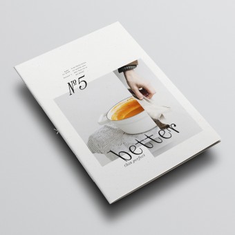
Everything we do or don't do - good and bad taste is always present. One of Austria's most successful food blogs focuses on good taste. And this is what her 5th magazine "better than perfect" is all about.
UNIQUE PROPERTIES / PROJECT DESCRIPTION:
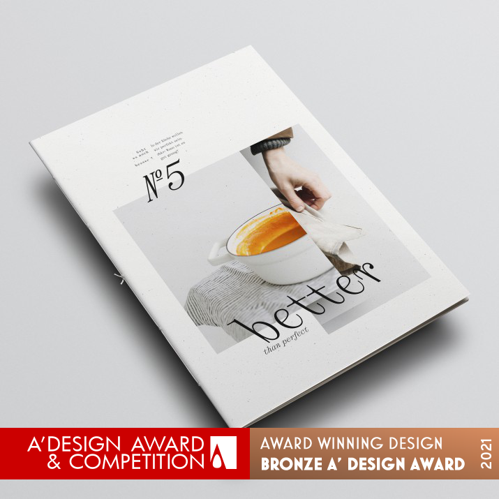
The main idea: to put an internet food blog on paper.
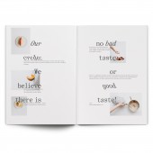
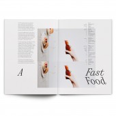
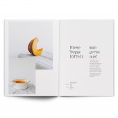
The recipes are creative yet simple, presented by means of impressive photos and lively typography. The advantages of print over the web are played out haptically and conceptually. The layout plays with and breaks viewing habits, visual tension and surprise accompany the reader through the magazine.
OPERATION / FLOW / INTERACTION:
The magazine is intended to inspire and encourage you to cook yourself. The range extends from very simple to more demanding recipes - so there is something for everyone. An ingredients index closes the magazine and also serves as a decision-making aid when selecting recipes or as a shopping list.
PROJECT DURATION AND LOCATION:
The project started in july 2020 and finished in december 2020.
FITS BEST INTO CATEGORY:
Graphics, Illustration and Visual Communication Design
|
PRODUCTION / REALIZATION TECHNOLOGY:
recycled paper made of birch, hp indigo digital printing
SPECIFICATIONS / TECHNICAL PROPERTIES:
22x31 cm, 32 pages, paper cover 300 g/m, paper core 120 g/m, thread stitching
TAGS:
Magazine, Photography, Typography
RESEARCH ABSTRACT:
Many of us have more time for ourselves at home this year. Your own kitchen will once again become a playground for creativity. The magazine should be a source of inspiration and motivation for more activity at home. Some recipes are very simple and thus have a low entry barrier even for beginners. The original context of a cooking magazine, following a recipe, is being questioned. The aesthetics of the ingredients and the arrangement on the plate are paramount.
CHALLENGE:
A visually influenced magazine that does not get lost in the flood of many cooking magazines. A unique selling point was found through the design and photography.
ADDED DATE:
2021-02-04 14:33:09
TEAM MEMBERS (1) :
Gerhard Kirchschläger, Karin Stöttinger, Julia Kirchschläger
IMAGE CREDITS:
Photographer Karin Stöttinger
PATENTS/COPYRIGHTS:
no IP / PATENTS / COPYRIGHTS
|
|
| CLIENT/STUDIO/BRAND DETAILS |
 |
NAME:
Gerhard Kirchschlaeger
PROFILE:
Gerhard Kirchschläger is a studio for graphic design in Wels, Austria. Design and typography is our lead discipline. Our work focuses on books, magazines, corporate design and brand design. Our clients are mainly in the art and culture sector. Typography is always the starting point for branding and editorial projects. Gerhard Kirchschläger is also a university lecturer for layout and typography at the Linz University of Art.
|
|
|
| COMMENTS |
| Giulia Esposito |
Comment #13198 on December 27, 2022, 12:57 pm |
|
I am absolutely in love with this magazine design! It is visually stunning, with a modern, yet timeless look. The colors, typography, and layout come together to create a truly unique and eye-catching design. I am particularly impressed with how the design showcases the content, making it easy to find and read, while still keeping the design interesting and engaging. This magazine design is truly "better than perfect". Congratulations to Gerhard Kirchschlaeger for winning the A' Design Award for Print and Published Media Design.
|
| Adam Harris |
Comment #80226 on January 4, 2023, 7:55 am |
|
I am absolutely impressed with the work of this designer! Better than Perfect is an innovative and creative magazine that stands out from the crowd of cooking magazines. The clever layout, impressive photos and lively typography make it a pleasure to explore. The recipes are simple yet inspiring, making it perfect for beginners who are looking to get creative in the kitchen. The magazine provides an interesting take on the traditional cooking magazine, questioning the original context of following recipes. It is truly a unique piece of design that is sure to inspire many. Congratulations on winning the A' Design Award!
|
| Chloe Turner |
Comment #87425 on January 4, 2023, 1:35 pm |
|
Kudos to the designer for creating an award-winning work that celebrates good taste! 'Better than Perfect' is a magazine that captures the notion that beauty and perfection can be found in everyday life and the small moments we experience. The designer has successfully crafted a visual story that is truly inspiring, with a combination of beautiful photography, design elements, and artful typography. It is no surprise that 'Better than Perfect' has been recognized and awarded with the A' Design Award, and it is a testament to the designer's remarkable talent and creative genius.
|
| Mark Allen |
Comment #89053 on January 4, 2023, 3:24 pm |
|
This award-winning work is an incredible example of how creative and simple recipes can be presented through impressive photos and lively typography. Haptically and conceptually, the layout brings a unique perspective to the magazine, playing with and breaking viewing habits. Visual tension and surprise accompany the reader through the magazine, making it a source of inspiration and motivation for more activity at home. The use of recycled paper made of birch and HP Indigo digital printing further add to the uniqueness of this work.
|
| Elisabeth Clark |
Comment #90213 on January 4, 2023, 4:42 pm |
|
I've been so impressed by Gerhard Kirchschlaeger's work - Better than Perfect - that won the A' Design Award in the Print and Published Media Design category. It's clear to see that a lot of research and thought has gone into the project to make it stand out and be truly unique. The concept of putting an internet food blog on paper is clever and creative, and the layout of the magazine challenges viewers' viewing habits, creating an engaging and suspenseful read. The recipes are inventive and simple, and the visuals accompanying them are stunning. It's clear that Gerhard has a passion for good taste and this is conveyed throughout the magazine. It's inspiring to see how Gerhard has taken the idea of a cooking magazine and questioned the traditional context, making the aesthetics of the ingredients and the arrangement on the plate the forefront of the project. Congratulations on your success - it's well deserved!
|
|
|
Did you like Gerhard Kirchschlaeger's Print Design?
You will most likely enjoy other award winning print design as well.
Click here to view more Award Winning Print Design.
Did you like Better Than Perfect Magazine? Help us create a global awareness for good print design worldwide. Show your support for Gerhard Kirchschlaeger, the creator of great print design by gifting them a nomination ticket so that we could promote more of their great print design works.
|
|

|
|
|
|
