A is van Os Book by Autobahn |
Home > Winners > #116728 |
 |
|
||||
| DESIGN DETAILS | |||||
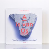
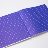
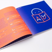
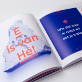
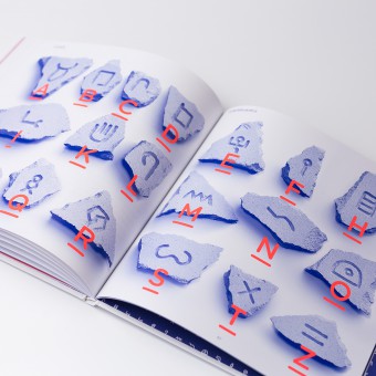
| DESIGN NAME: A is van Os PRIMARY FUNCTION: Book INSPIRATION: The initiative originated from the work ethos of Autobahn: text is image. Designer Rob Stolte was fascinated by the way his son was learning to write and would get him to copy the alphabet. A four year old's spatial insight is far from developed. They tend to write in different sizes, mirrored and upside down. It was during this process that Stolte recognised a number of alphabetical primordial forms. From there, he decided to design a series of objects explaining the history of our alphabet. UNIQUE PROPERTIES / PROJECT DESCRIPTION: A is van Os shows the development of each letter in four time periods in history. The changes are visualised in bright colours so they are easy to follow. Since the first letters were cut in stone, Autobahn hand carved all original letterforms in stone as a visual reference. The stone on the cover of the book is finished with a gravel coating so it becomes tactile. Besides the book Autobahn designed 3 typefaces which are free for download and can be used to send secret messages to friends in earlier forms of the alphabet. OPERATION / FLOW / INTERACTION: Text and image are insightful, worth knowing and in an appealing, hyper-hip style for kids; bright blue and almost fluorescent orange-red. Design, drawings and text are coherent and consistent, this entire book exudes the basic principle of the often awarded Autobahn: text is image. A wonderful book for all children and others who love letters, history and design. PROJECT DURATION AND LOCATION: The project started in 2016 and was published in 2018 in Dutch. It was exhibited at the 65th Type Directors Club New York in 12 countries, received a Golden European Design Award and was nominated for a D&AD award and a Dutch Creativity award. The book is translated into French in 2020 and in English in 2021 (Q4). FITS BEST INTO CATEGORY: Graphics, Illustration and Visual Communication Design |
PRODUCTION / REALIZATION TECHNOLOGY: Print: PMS 805, Reflex Blue Paper: Arctic Volume 115gr Hard cover: Cardboard wrapped in Wibalin Soft 300gr Varnish: Spot-UV gravel coating on cover Stones: Hand-cut and photographed SPECIFICATIONS / TECHNICAL PROPERTIES: Width 240 mm x Depth 240 mm Height 10 mm TAGS: Autobahn, Typography, Design, Graphic, Alphabet, Writing, Dutch, History, Book, Children RESEARCH ABSTRACT: Our alphabet has changed considerably over time. In short, it began 4,000 years ago with images carved into rock in the Sinai desert. This script (called Proto-Sinaitic) was adopted and modified by the neighboring Phoenicians (around 1500 BC). The Phoenicians were seafaring folk and granted the alphabet to the Greeks (around 800 BC); which made trading far easier. The Greeks slightly adapted the letter forms before handing them on to the Romans, who completed the alphabet. And it's this alphabet that we, in the Western world, still use today. CHALLENGE: To show this transition of the alphabet, Autobahn visualised the transformation for each letter with clear lines and color differences. Through this method, readers can easily follow the transformations, see how the letter developed and still see where it originated from. This aspect makes the book unique in its sort. ADDED DATE: 2021-01-27 14:35:04 TEAM MEMBERS (8) : Concept, design text and illustrations: Autobahn, Text: Bette Westera, Research and advice: Ben Haring, Advice and production: Drukkerij Wilco, Redaction, publishing and distribution: Uitgeverij Gottmer, Animation: Jochem Koopman, Documentary: Niels Mud and Product photography: Justina Nekrašaitė / De Monsterkamer IMAGE CREDITS: Photo's: © De Monsterkamer / Justina Nekrašaitė |
||||
| Visit the following page to learn more: https://bit.ly/2LkyaAc | |||||
| AWARD DETAILS | |
 |
A Is Van Os Book by Autobahn is Winner in Print and Published Media Design Category, 2020 - 2021.· Read the interview with designer Autobahn for design A is van Os here.· Press Members: Login or Register to request an exclusive interview with Autobahn. · Click here to register inorder to view the profile and other works by Autobahn. |
| SOCIAL |
| + Add to Likes / Favorites | Send to My Email | Comment | Testimonials | View Press-Release | Press Kit |
Did you like Autobahn's Print Design?
You will most likely enjoy other award winning print design as well.
Click here to view more Award Winning Print Design.


