Showni Clothing Boutique by Nianwei Zhu |
Home > Winners > #116702 |
 |
|
||||
| DESIGN DETAILS | |||||
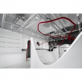
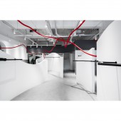
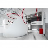
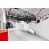
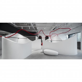
| DESIGN NAME: Showni PRIMARY FUNCTION: Clothing Boutique INSPIRATION: The designer presents to the greatest extent a unique exhibition space, which is different from the tradition, attractive and interesting, though limited in space. Through rearrangement of the spatial pattern with irregular curves, and displaying the models with simple colors, it echoes the concept of the brand to bloom the true self. A touch of strong red is applied to set off the unique rhythm, constantly affecting the customers' moods. UNIQUE PROPERTIES / PROJECT DESCRIPTION: Showni, a combination of the English word Show and the Chinese character Ni (you), is the Chinese homonym of the owner's name. It suggests staying true to the original inspiration on the road of pursuing dreams, constantly to "Be Ourselves And Show Ourselves". The designer believes that each space, as an independent entity and carrier, is writing its own unique story. OPERATION / FLOW / INTERACTION: The first indoor space comprises the reception area, bar area and lobby. The middle part of the space is the arc core area, serving as the display area of key products. The rear half of the space is the auxiliary functional area, including the small decorations display area, locker rooms and toilets. The left and right sides are respectively provided with the clothing display space. The partition walls are used to set up staggered opposite door openings on both sides, highlighting and differentiating the display attributes with the light strips and colors. PROJECT DURATION AND LOCATION: The project started in March 2019 in Suzhou and finished in May 2019 in Suzhou. FITS BEST INTO CATEGORY: Interior Space and Exhibition Design |
PRODUCTION / REALIZATION TECHNOLOGY: Large French windows at the facade introduce better light into the chambers to display the interior environment. The half-moon-shaped doorway highlights the shop out of the regular and square pattern of the shops facing the street, drawing the public attention. In the shop, the designer builds an arc structure of irregular curves in the central area of the conventional rectangular space, adjusts the spatial atmosphere and carries on the function partition via block insertion and curve visual modeling. SPECIFICATIONS / TECHNICAL PROPERTIES: The area is 108 sqm. TAGS: Retail, Interesting, Boutique, Display, Clothing RESEARCH ABSTRACT: The original top is maintained to preserve the space height. Red hoses are encircled and suspended in the space to create a new streamline and visual guidance. The red hoses are actually air conditioning hoses. As a common but easily overlooked material, they are creatively reused to exert a better functional value. They not only brighten up the space in colors, but also form an intense visual collision with the simple white overall design. Matching up with the overall circulation, the spatial interest is enhanced, forming an elaborated finishing touch. CHALLENGE: The on-site grinded terrazzo is replaced by the terrazzo floor tiles to effectively reduce the overall project cost. The acrylic red display booths and transparent shelves make the whole space lighter and more translucent. In the whole design process, a large number of curved surface modeling, and irregular red line design and fixation are applied, extremely creative and challenging. The final simple, graceful, modern and perfect presentation goes far beyond the owner's expectation. ADDED DATE: 2021-01-27 06:36:21 TEAM MEMBERS (1) : Min IMAGE CREDITS: Image #1: Photographer Shengsu Architectural Photography, Showni, 2019. Image #2: Photographer Shengsu Architectural Photography, Showni, 2019. Image #3: Photographer Shengsu Architectural Photography, Showni, 2019. Image #4: Photographer Shengsu Architectural Photography, Showni, 2019. Image #5: Photographer Shengsu Architectural Photography, Showni, 2019. |
||||
| Visit the following page to learn more: http://www.szugd.com/ | |||||
| AWARD DETAILS | |
 |
Showni Clothing Boutique by Nianwei Zhu is Winner in Interior Space and Exhibition Design Category, 2020 - 2021.· Read the interview with designer Nianwei Zhu for design Showni here.· Press Members: Login or Register to request an exclusive interview with Nianwei Zhu. · Click here to register inorder to view the profile and other works by Nianwei Zhu. |
| SOCIAL |
| + Add to Likes / Favorites | Send to My Email | Comment | Testimonials | View Press-Release | Press Kit |
Did you like Nianwei Zhu's Interior Design?
You will most likely enjoy other award winning interior design as well.
Click here to view more Award Winning Interior Design.


