DESIGN NAME:
One Excellent
PRIMARY FUNCTION:
Marketing Center
INSPIRATION:
In the entire project design, designer takes the ocean as the theme, from planning to architecture, giving the design unlimited poetry. The streamlined glass curtain wall and tower shape create an architectural mood like flowing water, injecting a bit of oriental culture and humanistic feelings into the futuristic and artistic building.
UNIQUE PROPERTIES / PROJECT DESCRIPTION:
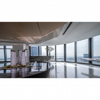
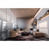
The 53F Cloud Reception Room of Qianhai No.1, with an area of about 1968 square meters and a floor height of 4.5 meters, provides a wide view of the city from the extreme, and the vision of Qianhai from the west, where the mind of the world is open. Flowers, trees and green plants bring a refreshing taste to the rational space, such as being in the mountains and flowing water, absorbing the fragrance of nature.
OPERATION / FLOW / INTERACTION:
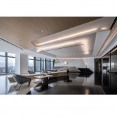
Visitors could move through the reception vestibule and enter the project display and multimedia interactive area, which shows more information about the company and the project for customers.The open negotiation area is placed in an orderly manner in the window area, which is naturally integrated with the display space and makes full use of the sunny advantage to create a comfortable and warm communication space.
PROJECT DURATION AND LOCATION:
The project was located in Shen Zhen, China. It was finished in August 2020.
FITS BEST INTO CATEGORY:
Interior Space and Exhibition Design
|
PRODUCTION / REALIZATION TECHNOLOGY:
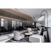
Gray as the main color of the space, in contrast with the noisy city, is understated and rational. The color of the space is changed on the light gray tone, and the overall color is like the seasons changing from cold to warm, so that the space is naturally combined with the design. The natural stone texture and the original wood color table harmonious transition, with a calm atmosphere of a single sofa to make the space simple and elegance.
SPECIFICATIONS / TECHNICAL PROPERTIES:
Total Area : 684 square meters
TAGS:
Office, Exhibition, Space, Gray, Warm
RESEARCH ABSTRACT:
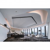
From the beginning of the drawing, the design team broke the initial layout of the space and divided the space with diagonal cuts to add vitality. Changing the spatial form of the building, adding different forms of partitions to connect the whole space, and then enriching the details of the building space, using furniture decoration to form different enclosures, making the space more diverse, permeable and smooth, and the social atmosphere more vivid, free and interesting due to the change of space, thus meeting the needs of use.
CHALLENGE:
In terms of space planning, the design team broke the rule of shape and divided the space with diagonal money cutting to increase the vibrancy.At the same time, different forms of partitions are added to connect the whole space, and the furniture is used to form different enclosures to make the space a more sensory experience.
ADDED DATE:
2021-01-15 09:16:31
TEAM MEMBERS (1) :
Zhi Duan, Shi Rong Liang, Yu Chen Qiu
IMAGE CREDITS:
ANAURA
|
