
|
|
| DESIGN DETAILS |
DESIGN NAME:
S6 Foundry
PRIMARY FUNCTION:
Brand System and Campaign
INSPIRATION:
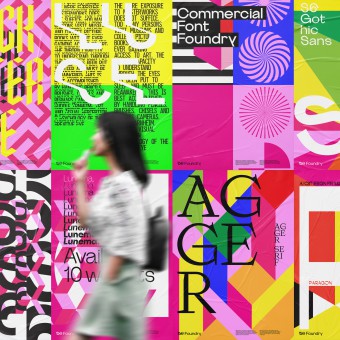
The branding system was inspired by the works of Clichés Schwitter, Gunnar Lilleng, and Max Bill, also the optical artists Bridget Riley and Franco Grignani. Inspired by traditional funfair signwriting and the vividness of colors used in the communication on their various sidings.
UNIQUE PROPERTIES / PROJECT DESCRIPTION:
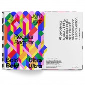
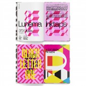
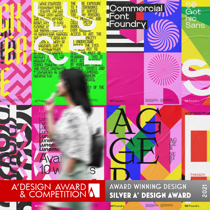
Based in Italy S6 Foundry develops commercial creative retail typefaces for use in digital and branding applications. The newly created brand required an identity that symbolized a new beginning. We developed a visual language to position the brand targeting international designers and communication buyers. The idea of joy and wonder with the eclectic nature of typeface design was at the heart of the branding process.
OPERATION / FLOW / INTERACTION:
The Interaction with the campaign was across both traditional outdoor and online social campaigns.
PROJECT DURATION AND LOCATION:
The project started in April 2020 and is an ongoing project.
FITS BEST INTO CATEGORY:
Graphics, Illustration and Visual Communication Design
|
PRODUCTION / REALIZATION TECHNOLOGY:
Printed Lithographic CMYK using FSC papers.
SPECIFICATIONS / TECHNICAL PROPERTIES:
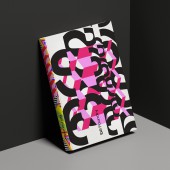
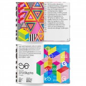
Hard-Back Book: 128 pages
Internal: CMYK on splendorgel FSC 160gsm
TAGS:
Font design, Branding, Identity, Type design
RESEARCH ABSTRACT:
We researched a blend of optical art systems and signwriting technics fusing them into a design system with a modern twist, designing a fresh distinctive feel to the identity and branding systems.
CHALLENGE:
The main creative challenge was to express the dynamic attitude of the digital Foundry and to express their vision of offering something new to the market without the traditional stereotyping of a font foundry.
ADDED DATE:
2021-01-08 11:34:08
TEAM MEMBERS (3) :
Paul Robb, Moira Bartoloni and Federica Simone
IMAGE CREDITS:
Paul Robb
|
|
| COMMENTS |
| Giulia Esposito |
Comment #12980 on December 27, 2022, 11:44 am |
|
I am truly impressed with S6 Foundry's Brand System and Campaign! It is evident that great effort and skill was put into the design process to create a visually stimulating, modern and innovative solution. The colors, fonts, and imagery used in the design are perfectly balanced, resulting in an outstanding user experience. From the experience of a design enthusiast, I can truly appreciate the creativity and hard work that was put into the project. Congratulations to Paul Robb and Moira Bartoloni for the prestigious A' Design Award for their work on S6 Foundry's Brand System and Campaign!
|
| Paul Williams |
Comment #58818 on January 3, 2023, 9:31 pm |
|
S6 Foundry is an outstanding example of excellent design, with a brand system and campaign that exemplifies the joy and wonder of typeface design. The visual language created by Paul Robb and Moira Bartoloni is inspired by the works of Clichés Schwitter, Gunnar Lilleng, and Max Bill, as well as the optical art of Bridget Riley and Franco Grignani. The research into optical art systems and signwriting technics, blended with a modern twist, has resulted in a dynamic and distinctive brand identity. The creative challenge of expressing the digital Foundry's vision was brilliantly achieved, and the finished product is a testament to the skill and dedication of Paul Robb and Moira Bartoloni.
|
| Paul Phillips |
Comment #68835 on January 4, 2023, 2:08 am |
|
I am absolutely delighted to see the success of the S6 Foundry's brand system and campaign! It's no surprise that this work has been awarded the A' Design Award as it is truly remarkable and noteworthy. The visual language exudes a sense of joy and wonder and perfectly captures the eclectic nature of typeface design. It is clear that a lot of thought and expertise has gone into crafting this brand and I can only imagine the amount of hard work and dedication it took to create this award-winning piece. Congratulations to Paul Robb and Moira Bartoloni on their success!
|
| Elena Petrenko |
Comment #72272 on January 4, 2023, 3:47 am |
|
The creative blend of traditional funfair signwriting and vivid colors provides a fresh and distinctive feel to the identity and branding of the S6 Foundry.
|
| Adam Harris |
Comment #79411 on January 4, 2023, 7:25 am |
|
I am totally in awe of the creativity and craftsmanship behind this winning work! The way the blend of optical art systems and signwriting techniques were fused into a unique design system with a modern twist is truly remarkable. It is a great example of how a brand can be successfully positioned to target international designers and communication buyers. The thoughtful combination of traditional funfair signwriting with the vividness of colors used in the communication really stands out. The work of Paul Robb and Moira Bartoloni is an inspirational example of great design that deserves to be applauded!
|
| Chloe Turner |
Comment #86770 on January 4, 2023, 1:01 pm |
|
It is inspiring to witness the creativity and skill of Paul Robb and Moira Bartoloni, as evidenced by their award-winning work "S6 Foundry". They have demonstrated a mastery of traditional funfair signwriting and optical art, bringing together the works of Clichés Schwitter, Gunnar Lilleng, Max Bill, Bridget Riley and Franco Grignani into a powerful and vibrant brand system and campaign. The colors they have employed really bring their work to life, and it is easy to appreciate how the message is resonating with viewers. The award is well-deserved recognition of their talent and dedication.
|
| Mark Allen |
Comment #88482 on January 4, 2023, 2:46 pm |
|
This work is an impressive example of modern design, combining traditional signwriting and optical art systems with a contemporary twist. The result is a distinctive brand identity, which perfectly captures the dynamic attitude and vision of the digital Foundry. The vibrant colors and eclectic nature of the typeface design truly bring joy and wonder to the viewer.
|
| Elisabeth Clark |
Comment #89621 on January 4, 2023, 4:02 pm |
|
I am absolutely amazed by Paul Robb and Moira Bartoloni's work 'S6 Foundry' which won the A' Design Award. Seeing the combination of optical art systems and signwriting technics, I am truly taken back by the fresh and distinctive feel that the identity and branding systems represent. It is inspiring to see how the visual language of the work symbolizes a new beginning while targeting international designers and communication buyers. It is clear that the idea of joy and wonder with the eclectic nature of typeface design is at the heart of the branding process. Congratulations to Paul Robb and Moira Bartoloni for the well-deserved A' Design Award.
|
|
|
