Kampot Packaging by Vighnesh Dudani |
Home > Winners > #114969 |
 |
|
||||
| DESIGN DETAILS | |||||
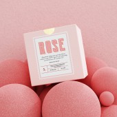
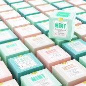
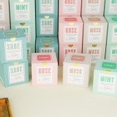
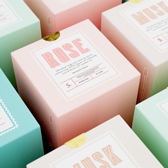
| DESIGN NAME: Kampot PRIMARY FUNCTION: Packaging INSPIRATION: There were a number of sources that have inspired this project. However, the most influential inspiration has been the very story of the brand conception and why it was formed in the first place. The brand comes with a vast heritage. Formed to promote the local and unique product offerings of their village (Kampot). And to employ the women of the village to help them make a living. Kampot is a village that most Cambodians are aware of and many elements of the design is inspired from there. UNIQUE PROPERTIES / PROJECT DESCRIPTION: The design originates from the unique story of a rare product. To do justice to the same, the packaging is a blend of the narrative of traditional processes being used to compete in a modern and constantly evolving market. The packaging stands apart due to the use of a mix of vintage typography with modern colours and aesthetics. Where one is reflecting on the heritage of the brand while the other resonates with the idea of staying relevant to the changing times. OPERATION / FLOW / INTERACTION: The soaps developed by Kampot are either for helping make the consumers skin better or help cure existing skin infections and other such skin related issues. Since many of these consumers are often in pain or dealing with skin irritation, the packaging is designed to help them in the moment by giving a very soothing sensation to the eyes. The idea is to keep it welcoming and relieving since the soaps are meant to do exactly that for the users skin. The packaging also has the balance of modern applications through the use of pastel colours blended with ancestral knowledge that is conveyed via the typography. PROJECT DURATION AND LOCATION: Duration: 6 months Location: India FITS BEST INTO CATEGORY: Packaging Design |
PRODUCTION / REALIZATION TECHNOLOGY: Locally sourced paper pulp that is printed using offset printing technique. The paper is completely recyclable and produced using sustainable means and old techniques. Plastic use has been completely avoided in the entire packaging. To the extent, the paper hasn't been laminated as well. SPECIFICATIONS / TECHNICAL PROPERTIES: The packaging is a square box that is of the following dimensions 130mm X 130mm X 130mm. It is a single walled box where the soap and loofah has been directly placed without the use of any unnecessary packing material. TAGS: soap, beauty, packaging, branding, cambodia, natural, retro RESEARCH ABSTRACT: The research was much like a vast mood board of principles and visual structures of multiple brands in a similar space. Surveys were conducted amongst the target audience to understand their likes and dislikes, their experience with skincare products and their desires when it comes to the same. The results of these surveys helped us lock onto the colour palettes and on a more crucial level made us add complimentary pumice stones/loofahs in every box to enhance the consumer experience. CHALLENGE: It was challenging to stick to a single direction for the packaging. The business has grown through so many phases that it was difficult to simply reflect on one. Each phase of the business was crucial enough to not be ignored. Further, was the challenge of having a retro touch without the use of retro colours/textures which are generally more saturated than pastels. The solution to which was to use more than a single direction for different elements and make them work in harmony together. ADDED DATE: 2020-12-28 04:01:42 TEAM MEMBERS (1) : IMAGE CREDITS: Vighnesh Dudani, 2021. |
||||
| Visit the following page to learn more: https://bit.ly/3jWyrqC | |||||
| AWARD DETAILS | |
 |
Kampot Packaging by Vighnesh Dudani is Winner in Packaging Design Category, 2021 - 2022.· Read the interview with designer Vighnesh Dudani for design Kampot here.· Press Members: Login or Register to request an exclusive interview with Vighnesh Dudani. · Click here to register inorder to view the profile and other works by Vighnesh Dudani. |
| SOCIAL |
| + Add to Likes / Favorites | Send to My Email | Comment | Testimonials | View Press-Release | Press Kit | Translations |
Did you like Vighnesh Dudani's Packaging Design?
You will most likely enjoy other award winning packaging design as well.
Click here to view more Award Winning Packaging Design.


