Lifelong Online E-commerce Website by Centrick |
Home > Winners > #113075 |
 |
|
||||
| DESIGN DETAILS | |||||
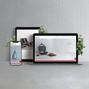
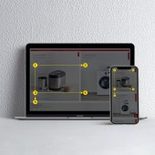
| DESIGN NAME: Lifelong Online PRIMARY FUNCTION: E-commerce Website INSPIRATION: To create this new online destination, Centrick studied human behaviour in the offline world and sought inspiration from it. In crowded market places, retention time and engagement was particularly low. Beautiful spaces seemed to better engage audiences, increase their time spent with products and thus boosted sales. However these designed spaces were synonymous with luxury and big ticket items. Centrick found a gap and bridged it. The team took inspiration from beautifully designed showrooms and coupled it with the offerings of a market place. The result was an online destination that showcased high value products in an aesthetically pleasing environment. Given that such websites have 3 seconds before potential customers turn their backs and walk away without learning about the brand or what's on offer, this design principle changed the way e-commerce and online marketplaces were thought and designed in India. UNIQUE PROPERTIES / PROJECT DESCRIPTION: Centrick simplified architecture, balanced aesthetics with speed, added invention to engineer this online experience. Research proves content is consumed at amazing speeds in an "F" pattern. Important information was placed along this pattern to drive conversions. Tickers used to rapidly convey information were built into this platform. Filters re-engineered for navigation to educate and enhance user experience. A singular visual language ensured ease, efficiency and scalability. OPERATION / FLOW / INTERACTION: Core navigation, secondary navigation and tickers were made to follow the “F” shaped pattern for reading web content. Care, a single click for service, extending warranties and tutorials, was placed at its very edge. They pushed the standards of Shopify and enhanced its fundamental components. They changed the construction of collections into eye catching multi grid systems. Their collective obsession to simplify and create efficient and responsive design was at the core of this website. PROJECT DURATION AND LOCATION: The project started on 15 May 2020 and taken live on 14th July 2020. This included photography of over 130 products in 32 hours and during India's harshest lockdown. The centre for design was in Mumbai. Coding and Development was in Nasik. The brand was based in Delhi. |
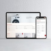
PRODUCTION / REALIZATION TECHNOLOGY: It started with Centrick's obsession to make things look good, thus perform better. The design revolved around the philosophy "Minimal Maximal". Minimal in style, maximum in function. How a site is organised, dramatically affects how a customer feels. The information architecture minimised information overload, easing customer decisions. Clutter leads to fatigue, so space was used as a resting place for the eye. The 3 second rule of e-commerce was not just respected, but built around. SPECIFICATIONS / TECHNICAL PROPERTIES: Shopify was the chosen platform. So, collections had to be re-engineered. Category tags and filters were redesigned as a multi-grid system to educate the offering of each collection. Product features drive sales. Carousels were reconstructed to showcase features, a first on this platform. Tickers, another first, were integrated to deliver efficiency and seamless communication. A clean and minimal visual style ensured aesthetics and speed, allowing the team to capture 300 shots in 32 hours. TAGS: User Experience, User Interface design, Human Centrick Design, Behaviour Design RESEARCH ABSTRACT: Human Study was the foundation of our research methodology. They used tools like ethnography on site, retail observation, purchase decision hierarchy and mystery shopping experiments. Results proved Indian online shoppers seek value in each purchase. E-commerce sites tend to build a lot of clutter to resemble neighbourhood markets. But, this failed to find a sweet spot with online audiences. This endorsed the design philosophy "Minimal Maximal" which cleared the clutter to power sales. CHALLENGE: The hardest challenge was creating a visual style that aided rapid production of assets while retaining the aesthetic value of the website. It needed a system to reduce time, cost, bringing expandability and scalability to match ease and creativity. Shopify was restrictive. It needed invention across interfaces. During a lockdown 130 products had to be catalogued in 32 hours. It required logistic planning of a whole other level. Centrick had to be uncompromising in design and engineering. ADDED DATE: 2020-10-18 06:14:41 TEAM MEMBERS (5) : Roy Menezes, Yash Chauhan, Zara Daruwalla, Malavika Shah and Anamta Shaikh IMAGE CREDITS: Centrick, 2020. |
||||
| Visit the following page to learn more: https://bit.ly/39P73Gn | |||||
| AWARD DETAILS | |
 |
Lifelong Online E-Commerce Website by Centrick is Winner in Website and Web Design Category, 2020 - 2021.· Read the interview with designer Centrick for design Lifelong Online here.· Press Members: Login or Register to request an exclusive interview with Centrick. · Click here to register inorder to view the profile and other works by Centrick. |
| SOCIAL |
| + Add to Likes / Favorites | Send to My Email | Comment | Testimonials | View Press-Release | Press Kit |
Did you like Centrick's Web Design?
You will most likely enjoy other award winning web design as well.
Click here to view more Award Winning Web Design.


