DESIGN NAME:
Drinkfinity Rebrand
PRIMARY FUNCTION:
Branding
INSPIRATION:
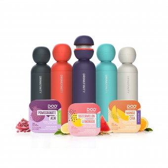
Water is boring. Water bottle brands have become stale by falling into the 'Insta design' trap. Drinkfinity is about bringing excitement back to hydration. Our identity and visual language was Miami-inspired, both fun and cool, to capture the creative idea “Pop the Unexpected”. The packaging became stylish–-a fresh face to reintroduce the brand in a way that connects emotionally. Packaging was a statement of style so a sleek paperboard cylinder with embossed elements was chosen.
UNIQUE PROPERTIES / PROJECT DESCRIPTION:
Launched in 2018, Drinkfinity was introduced as a breakthrough beverage innovation for a new generation of health-minded consumers. They were a challenger brand in a sea of stiff competition and found themselves struggling with their own identity. As a beverage startup and PepsiCo venture, they were working with limited resources, tight timing and aggressive sales goals. The challenge was to make this brand a real world success with a 360º restage.
OPERATION / FLOW / INTERACTION:
1st place winner of 2020 Dieline awards, worlds best packaging in Soft Drinks category
PROJECT DURATION AND LOCATION:
6 months from kickoff to delivery of final packaging
FITS BEST INTO CATEGORY:
Packaging Design
|
PRODUCTION / REALIZATION TECHNOLOGY:
The design idea was driven by their roots, a Miami born startup. We also reframed what they offered from infinite flavors to infinite hydration, making the brand your hydration sidekick.
SPECIFICATIONS / TECHNICAL PROPERTIES:
Bottle: heavy paperboard canister approximately 10 inches/ 4 inch diameter.
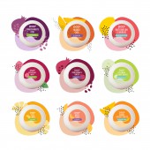
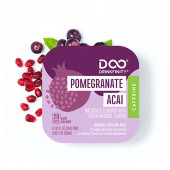
Flavor pods: paperboard overwrap approximately 3.5 x 3.5 inches.
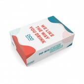
D2C box - corrugated card approximately 12 x 8 x 8 inches.
Campaign content: digital media and video
TAGS:
branding, rebrand, packaging redesign, brand experience, brand transformation, digital branding, future-ready branding, brand purpose
RESEARCH ABSTRACT:
Once the brand launched in retail, research included branding validation to understand consumer perceptions, decision making criteria, interest in the proposition. Over 2 days, we executed 10-12 intercepts of consumers at two Bed Bath and Beyond locations. We asked an array of questions to garner details on the brand, retail display, messaging, etc. We spoke with employees to gather details on their thoughts about the display and their interactions with shoppers and Drinkfinity.
CHALLENGE:
With a large portfolio of complex flavors and a bottle that didn’t deliver on expectations, they had their work cut out for them. Brand communications were scattered, so with no clear story, or call to action, they weren’t connecting with the right consumers. With aggressive goals from parent company, PepsiCo, Drinkfinity was at a critical juncture and at threat to be discontinued. To succeed, they needed to define a brand purpose that would take the brand from functional to emotional.
ADDED DATE:
2020-09-29 20:38:18
TEAM MEMBERS (5) :
Creative Director: Adrienne Muken, Audra Schroeder: Designer, Digital Producer: Kaela Hill, Strategy Director: Jenn Morrissey and Senior Business Development Director: Georgia Holben
IMAGE CREDITS:
PepsiCo Design team
|


