Labelist Cosmetics Skin Care Package by Brava Design |
Home > Winners > #111621 |
 |
|
||||
| DESIGN DETAILS | |||||
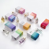
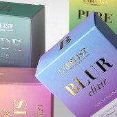
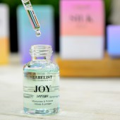
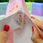
| DESIGN NAME: Labelist Cosmetics PRIMARY FUNCTION: Skin Care Package INSPIRATION: The range of colors was chosen to evoke the consumer in a healthier environment. The idea was that when the consumer saw the Hoot product, for example, an explosion of vitamins came to his or her mind. It was decided to make gradients by adding iriodin varnish to give movement to the packaging. Also, the team wanted to give a special importance to the user’s experience. That’s why they mixed the soft touch varnish, which has a soft touch, with the contrast of iriodin which has small glitter particles. The packaging contains a pre-cut that allows the consumer to see the inside without opening it completely. UNIQUE PROPERTIES / PROJECT DESCRIPTION: Structure, branding and packaging design for Labelist Cosmetics. They have created a new cosmetic brand following the Clear Beauty trend, which includes 9 different cosmetics. The cosmetic line is divided into 3 levels: the essential that any skin needs, the treatment ones (which are the most important for any skin) and the intensives that they do a shock treatment to the skin. OPERATION / FLOW / INTERACTION: The formulas are minimalist, streamlined with pure and reliable ingredients. The additives are minimal, those necessary to guarantee the maximum effectiveness of each product. They are not tested on animals (cruelty-free) and do not contain the following ingredients considered harmful: SLS, SLES, parabens, formaldehydes, ophthalates or hydroquinone. PROJECT DURATION AND LOCATION: The project started in July 2019 in Barcelona and finished in August 2020 in Barcelona, and it will be exhibited in sales platforms in November 2020. FITS BEST INTO CATEGORY: Packaging Design |
PRODUCTION / REALIZATION TECHNOLOGY: 3-ink offset printing on graphic cardboard. A black ink with two Pantone that blend into a gradient (different in each model). Silver stamping (essential and intensive) and gold stamping for treatment. Varnish soft touch on white areas to emphasize softness Iriodin varnish in colored areas. It shines with a pearly dot and touches of glitter that make gradients stronger and more nuanced. The interior is printed in 2 inks (the same two Pantone as on the face). SPECIFICATIONS / TECHNICAL PROPERTIES: 60 x 36 x 106 mm A pre-cut has been set up on one side of the pack so you can unfold the box and see the "how to use" and other information. TAGS: cosmetics, packaging, graphic design, clean beauty, slow beauty, beauty, rejuvenating RESEARCH ABSTRACT: In the pre-sale activation this year, this new brand has successfully captured the attention of various international distributors who want to place it on the market. CHALLENGE: The biggest challenge was to design a new packaging for a frenetic sector, cosmetics, in which new designs come onto the market almost daily. This fact marked us from the beginning. The goal was to innovate and create an attractive design, but at the same time fulfilling the mission of the project. What was the hardest part of this design activity. Maintain the visual characteristics that the whole marketing team wanted to offer to this new cosmetic line, but with a tight printing budget. ADDED DATE: 2020-09-28 16:22:52 TEAM MEMBERS (5) : Structure & Graphic Design: Gal-la Termes, Brand Manager: Esperança Figuerola, PR Manager: Marta Rodríguez, Support Designer: Antonio Castilla and IMAGE CREDITS: Image #1: Martí Casanellas Image #2: Martí Casanellas Image #3: Martí Casanellas Image #4: Marc Xalabarder Image #5: Marc Xalabarder |
||||
| Visit the following page to learn more: http://itsbrava.com/ | |||||
| AWARD DETAILS | |
 |
Labelist Cosmetics Skin Care Package by Brava Design is Winner in Packaging Design Category, 2020 - 2021.· Read the interview with designer Brava Design for design Labelist Cosmetics here.· Press Members: Login or Register to request an exclusive interview with Brava Design. · Click here to register inorder to view the profile and other works by Brava Design. |
| SOCIAL |
| + Add to Likes / Favorites | Send to My Email | Comment | Testimonials | View Press-Release | Press Kit | Translations |
| COMMENTS | ||||||||||||||||||||
|
||||||||||||||||||||
Did you like Brava Design's Packaging Design?
You will most likely enjoy other award winning packaging design as well.
Click here to view more Award Winning Packaging Design.


