Sooyou Beauty Salon by Peihe Xie |
Home > Winners > #110998 |
 |
|
||||
| DESIGN DETAILS | |||||
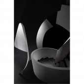
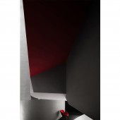
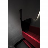
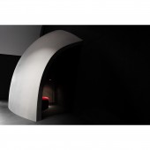
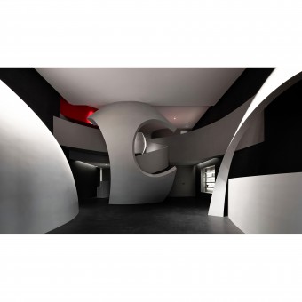
| DESIGN NAME: Sooyou PRIMARY FUNCTION: Beauty Salon INSPIRATION: Situated at Qunli New District, Harbin, China, the project is a beauty salon that mainly targets female consumers. The entrance wall echoes the arcs of the architecture with its curved shape, creates a unique perspective to look inside, and indicates a sense of mystery in the space. The spatial design is aimed at evoking certain underlying body memories of people. UNIQUE PROPERTIES / PROJECT DESCRIPTION: As the largest organ of human body, skin is the interface between the physical body and the outside world. Cells are constantly dying, and new ones are being made simultaneously, to maintain the healthy state of the body. The design firm drew inspiration from the constant fission of cells in human body, and translated it into spatial structures via geometric shapes and basic lines. The "fission" of structures creates rich experiences along the circulations while also providing privacy. OPERATION / FLOW / INTERACTION: This is a beauty salon, in the space, straight lines and curves are combined to outline large geometric blocks, and the cool concrete generates dramatic visual effects. Lines stretch and interweave, indicating the fluidity of human cells. As the customers slowly move within the space, the contrast of the static and dynamic will become more apparent. PROJECT DURATION AND LOCATION: Start time: January 2020 Completion time: July 2020 Location: Harbin, China FITS BEST INTO CATEGORY: Interior Space and Exhibition Design |
PRODUCTION / REALIZATION TECHNOLOGY: The overall space is dominated by dark hues, with the areas illuminated as spatial highlights. Shadows extend along the edges of light, leaving infinite room for imagination. The shift of brightness and darkness at different layers stimulates emotional liberation, and offers calming and free experiences throughout the space. Gray and black shades set the overall tone of the space, which is highlighted and enlivened by a red hue. SPECIFICATIONS / TECHNICAL PROPERTIES: Area: 450 sqm Main materials: cement paint, felt, wall finishes, stone panels TAGS: Beauty salon, AD ARCHITECTURE, Dark, Cell, Xie Peihe, Art RESEARCH ABSTRACT: The project is a pioneering experiment that AD ARCHITECTURE carried out in commercial space design. It breaks conventional order, and injects mysterious and fun characters into the space. The designers drew on the fission and motion of cells to conceive this differentiated space, and finally produced abstract bionic aesthetic. CHALLENGE: Due to the limited budget, the designers chose to use wooden splints to realize the complex spatial form and structures, which required high degree of accuracy of size, positions and proportions. Moreover, because of COVID-19, the design team was not able to instruct the construction work on site, but simply communicated with workers through video to control the whole construction process, which posed a big challenge to the execution of design solutions. ADDED DATE: 2020-09-25 09:19:58 TEAM MEMBERS (3) : Chief designer: Xie Peihe, Design team: AD ARCHITECTURE and IMAGE CREDITS: Ouyang Yun |
||||
| Visit the following page to learn more: http://reurl.cc/Xe62vg | |||||
| AWARD DETAILS | |
 |
Sooyou Beauty Salon by Peihe Xie is Winner in Interior Space and Exhibition Design Category, 2020 - 2021.· Read the interview with designer Peihe Xie for design Sooyou here.· Press Members: Login or Register to request an exclusive interview with Peihe Xie. · Click here to register inorder to view the profile and other works by Peihe Xie. |
| SOCIAL |
| + Add to Likes / Favorites | Send to My Email | Comment | Testimonials | View Press-Release | Press Kit |
Did you like Peihe Xie's Interior Design?
You will most likely enjoy other award winning interior design as well.
Click here to view more Award Winning Interior Design.


