Oink Packaging by STUDIO 33 |
Home > Winners > #110499 |
 |
|
||||
| DESIGN DETAILS | |||||
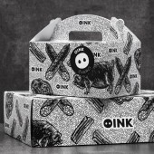
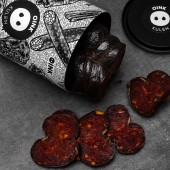
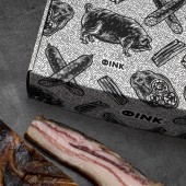
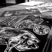
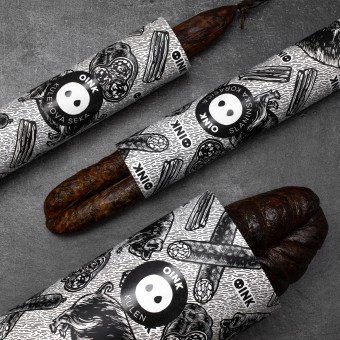
| DESIGN NAME: Oink PRIMARY FUNCTION: Packaging INSPIRATION: OINK is a well known onomatopoeia of the sound the pig makes, but name needs to be considered for several reasons. Oink contains the word Ink, which denotes blackness as a reference to a black pig. UNIQUE PROPERTIES / PROJECT DESCRIPTION: Naming and packaging design for original, delicious, traditional, homemade black pig products. The packaging denotes the distinctive approach to breeding black pigs and top notch products. The illustrations are executed in the linocut technique, which offers a distinctive handwork approach, present a range of products and directly evoke their flavours and textures. OPERATION / FLOW / INTERACTION: Packaging and labelling problems have been turned into benefits. We have simplified and reduced the cost of production, storage, packaging and preparation for delivery. The new packaging leaves a whole new impression on customers and how they perceive the Oink brand.� PROJECT DURATION AND LOCATION: The project started in April 2019 in Osijek and finished in October 2019 in Osijek FITS BEST INTO CATEGORY: Packaging Design |
PRODUCTION / REALIZATION TECHNOLOGY: The illustrations are executed in the linocut technique, scanned and traced in Adobe Illustrator. Final digital illustrations were placed on different paper tube or box packaging. For the background we used pig skin illustration while on the rest of the packaging there are illustrations of a black pig and products made of the black pig, such as bacon, sausages, and special kind of a salami named kulen. SPECIFICATIONS / TECHNICAL PROPERTIES: Tube packaging 60 mm x 60 mm x 560 mm 130 mm x 60 mm x 360 mm Box Packaging 195 mm x 140 mm x 110 mm TAGS: packaging, oink, black pig, branding, identity, studio 33, bacon, sausage, meat RESEARCH ABSTRACT: The main problem with primary packaging was the difference in width and height dimensions and the use of standard vacuum films, which are quite unattractive and don't leave a lot of design options. We wanted to develop a packaging which will transform packing and labelling problems into benefits. We have simplified and reduced the cost of production, storage, packaging and preparation for delivery. The new packaging leaves a whole new impression on customers and how they perceive the Oink brand.� CHALLENGE: Develop a product brand name, positioning, Identity and packaging design for Slavonian black pig dried meat products. The main problem with packaging was the difference in width and height dimensions and the use of standard vacuum films, which are quite unattractive and don't leave a lot of design options. ADDED DATE: 2020-09-21 07:52:30 TEAM MEMBERS (4) : Designer and Art Director: Leo Vinkovic, Illustrator: Maja Gjajic, Copywriter: Tonci Klaric and Photographer: Marija Gasparovic IMAGE CREDITS: Image #1: Photographer Marija Gasparovic, 2019 Optional Image #1: Photographer Marija Gasparovic, 2019 Optional Image #2: Photographer Marija Gasparovic, 2019 Optional Image #3: Photographer Marija Gasparovic, 2019 Optional Image #4: Photographer Marija Gasparovic, 2019 PATENTS/COPYRIGHTS: OINK Trademark (2020) Sin Ravnice |
||||
| Visit the following page to learn more: https://studio33.hr/work/oink | |||||
| AWARD DETAILS | |
 |
Oink Packaging by Studio 33 is Winner in Packaging Design Category, 2020 - 2021.· Read the interview with designer STUDIO 33 for design Oink here.· Press Members: Login or Register to request an exclusive interview with STUDIO 33. · Click here to register inorder to view the profile and other works by STUDIO 33. |
| SOCIAL |
| + Add to Likes / Favorites | Send to My Email | Comment | Testimonials | View Press-Release | Press Kit | Translations |
Did you like Studio 33's Packaging Design?
You will most likely enjoy other award winning packaging design as well.
Click here to view more Award Winning Packaging Design.


