IBIS Bread Culinary Explorers Rebranding by Wolkendieb Design Agency |
Home > Winners > #108487 |
 |
|
||||
| DESIGN DETAILS | |||||
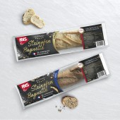
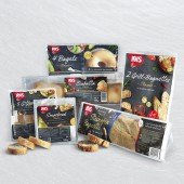
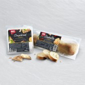
| DESIGN NAME: IBIS Bread Culinary Explorers PRIMARY FUNCTION: Rebranding INSPIRATION: IBIS Backwaren brings bread specialities into German market for over 30 years. In order to get to the next level of recognition in shelves, design agency Wolkendieb relifted their brand image. The task was to reflect the quality and versatility of the product range. Therefore, the whole brand portfolio was redesigned, extended and separated in two categories: bread and viennoiseries. By creating different looks according to consumer insights, portfolio was clearer structured and finally got that missing wow-effect. UNIQUE PROPERTIES / PROJECT DESCRIPTION: Showcasing recipes for every product demonstrates how easy it is for the consumer to indulge himself home. The bread range gathers iconic specialities such as French baguette, Finnish bread or Italian Ciabatta. Top-viewed photos in the making on a dark slate background show how tasty and modern the brand is. The result is a trendy and premium design with a strong encouragement message for the consumer to try it home. OPERATION / FLOW / INTERACTION: Old IBIS products had a low to inexistant focus on brand image. After Wolkendieb's brand and packaging relaunches, in-shelf recognition from consumers has dramatically increased, therefore boosting the sales. Each product has its own tasty recipe and atmosphere. A white serif script finishes off the homemade touch. Wolkendieb created a new logo which acts as a quality flag on the packaging. Each product family is visualised through icons and on-pack statements, which show the versatility of the new IBIS design. PROJECT DURATION AND LOCATION: The project started in July 2018 in Aachen, Germany and finished in December 2019. It was exhibited in ISM Cologne trade fair in January 2020. FITS BEST INTO CATEGORY: Packaging Design |
PRODUCTION / REALIZATION TECHNOLOGY: All products are packed in either molded film, flow packs or film bags. Some products are labelled, some are directly film printed. The aim was to create a consistent and modern brand image for the bread range under consideration of the different printing methods. SPECIFICATIONS / TECHNICAL PROPERTIES: Printed or labelled films with different sizes according to each product’s characteristics. The back of packagings are always free of design to allow the consumer to see the products correctly and most of the time, there is a window in the front. TAGS: packaging, brand image, rebranding, Wolkendieb, mass market, range, Ibis Backwaren, bakery, bread, Germany RESEARCH ABSTRACT: Together, Wolkendieb and IBIS explored the brand image and brand platform by using focus group discussions with IBIS consumers and non-consumers. Design ideas for rebranding and packaging relaunch, based on these insights, were proposed by Wolkendieb. New brand identity and new packagings were extensively tested with both already-consumers and non-consumers of IBIS. The new brand image was positively received in both target groups. CHALLENGE: The challenge for the design agency Wolkendieb was to create an eye-catching and modern design that would boost the quality feeling of the products without over-selling them. The new brand image had to incorporate controversial objectives, and had to fit with a pre-defined brand platform. ADDED DATE: 2020-07-24 11:02:24 TEAM MEMBERS (3) : Creative Director: Annika Reuber, Art Director: Chloé Noret and Junior Art Director: Daskia Frohn IMAGE CREDITS: Image #1: IBIS, Bread Culinary Explorers, 2020 Image #2: IBIS, Bread Culinary Explorers, 2020 Image #3: IBIS, Bread Culinary Explorers, 2020 Image #4: IBIS, Bread Culinary Explorers, 2020 Image #5: IBIS, Bread Culinary Explorers, 2020 |
||||
| Visit the following page to learn more: http://www.wolkendieb.com | |||||
| AWARD DETAILS | |
 |
Ibis Bread Culinary Explorers Rebranding by Wolkendieb Design Agency is Winner in Packaging Design Category, 2020 - 2021.· Read the interview with designer Wolkendieb Design Agency for design IBIS Bread Culinary Explorers here.· Press Members: Login or Register to request an exclusive interview with Wolkendieb Design Agency. · Click here to register inorder to view the profile and other works by Wolkendieb Design Agency. |
| SOCIAL |
| + Add to Likes / Favorites | Send to My Email | Comment | Testimonials | View Press-Release | Press Kit | Translations |
Did you like Wolkendieb Design Agency's Packaging Design?
You will most likely enjoy other award winning packaging design as well.
Click here to view more Award Winning Packaging Design.


