Transformers the Skin Test House Pop Up Store by Hsuan-Hui Lee |
Home > Winners > #107197 |
 |
|
||||
| DESIGN DETAILS | |||||
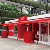
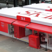
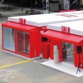
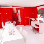
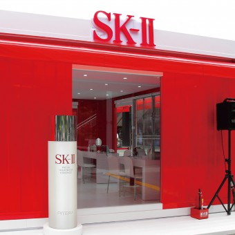
| DESIGN NAME: Transformers the Skin Test House PRIMARY FUNCTION: Pop Up Store INSPIRATION: This design aims for the brand marketing of SK-II, a Japanese cosmetics brand, in a form of pop up store. This design is a new type of operation which creative marketing strategies are integrated with retail stores under the concept of pop-up shop, featuring its temporariness and portability. It brings residents to a good understanding of the products of the brand and enables them to feel the atmosphere inside the shop in exhibition sessions regardless of location. UNIQUE PROPERTIES / PROJECT DESCRIPTION: The design theme is Transformers: The Skin Test House of SK-II. It is meant to be a holistic strategy of brand marketing that can establish social interaction with people in urban public places! OPERATION / FLOW / INTERACTION: The building volumes can be assembled in 12 hours. The assembly methods include one, one plus one, two plus two, etc. In view of quick assembly, the shop would be built for testing before arriving at the sites. The process is under scrutiny to reach flawless quality. The details are written below: 1.Canopy would be attached to the houses for rainy weather. 2.The showcases can be switched in position. 3.The automatic doors can be replaced with sliding ones. 4.The sizes of tables and chairs are adjustable to maximize the number of them. 5.When sole container is in use, there would be only one entrance. PROJECT DURATION AND LOCATION: Time: January, 2020 Location: The most visited areas beside the most popular department stores of Taiwan for exhibition events which had held 60 sessions within a year. FITS BEST INTO CATEGORY: Interior Space and Exhibition Design |
PRODUCTION / REALIZATION TECHNOLOGY: Wooden materials, eco-friendly materials, LED lights. All the employed materials are eco-friendly and reusable, to the extent that the process of assembly and disassembly have been completed for 60 times. SPECIFICATIONS / TECHNICAL PROPERTIES: Size of sole container: W1620 x H290 x D480 cm The size of the design simulates that of glass container house and contemporary glass house, and the container is built from steel structure. The indoor spaces of all the houses are 225 cm in height. The floor, ceiling, and walls are planned to be made of wooden materials, all of which are eco-friendly. The containers have been repeatedly used for display for approximately 60 times. TAGS: pop-up shop, creative marketing, Birkin, exhibition, exhibition space, exhibition design, retail design, brand marketing RESEARCH ABSTRACT: The design, inspired by pop up shops, is considered the second marketing center of the brand when the first refers to the designated counter in the department store. The advantages of this design include: 1. It can be constructed in different quantity of containers. 2. It visually attracts people. 3. It can display the features of the brand with showcases, and purpose of the event with videos. The design integrates world trends in fashion and utilizes sound and light effects. The carriers improve the publicity of the products, and the brand value will leave a good impression on the public. CHALLENGE: This design is the result from gradual advances of the glass house, which had spent two and half years on fixing the defects in slidable floors during raining days, inability of altering the numbers based on different demands, inability of assembly, inability of displaying products with lamps other than light boxes, to name but few. To date, the upgrades of canopy, product showcases, and LED light boxes have made the design fits requirements for all trade fairs in Taiwan. The design integrates into the public with interactive experience to make the spirit of the brand more widely valued. ADDED DATE: 2020-06-27 08:04:55 TEAM MEMBERS (1) : Birkin Creative Integrated Marketing IMAGE CREDITS: Birkin Creative Integrated Marketing |
||||
| Visit the following page to learn more: http://bit.ly/3gMhk8U | |||||
| AWARD DETAILS | |
 |
Transformers The Skin Test House Pop Up Store by Hsuan-Hui Lee is Winner in Interior Space and Exhibition Design Category, 2020 - 2021.· Read the interview with designer Hsuan-Hui Lee for design Transformers the Skin Test House here.· Press Members: Login or Register to request an exclusive interview with Hsuan-Hui Lee. · Click here to register inorder to view the profile and other works by Hsuan-Hui Lee. |
| SOCIAL |
| + Add to Likes / Favorites | Send to My Email | Comment | Testimonials | View Press-Release | Press Kit |
| COMMENTS | ||||||||||||
|
||||||||||||
Did you like Hsuan-Hui Lee's Interior Design?
You will most likely enjoy other award winning interior design as well.
Click here to view more Award Winning Interior Design.


