DESIGN NAME:
Symphony of Lights
PRIMARY FUNCTION:
Residence
INSPIRATION:
In order to create a minimalist modern style that the owner prefers, the designers tried to interpret the design of the shrine with a novel expression so as to get cast off the traditional impression of shrines being high-chromatic plastic products. In terms of color application, the designers approached from the perspective of traditional Chinese color psychology. In public areas, they used black, white, and brown that respectively symbolize health, academic performance, and wealth. Endless blessings are written into the space with psychological indications, while at the same time paired with the shrine to create calm Zen aesthetics.
UNIQUE PROPERTIES / PROJECT DESCRIPTION:
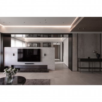
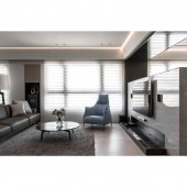
The majestic Buddha statue sitting in the back of the living room and the black and white colors are key elements in this soothing covert residence. The refined layers of lines and the intuitive impression of special materials help fuse the ever-changing light and shadow both from the outside and inside, presenting the consistently extraordinary design. The special lowered TV wall in the center links the multi-color design together, opening up a visual imagination and also partitioning the public areas. In a calm and modern poetic imagery, a fortress that seems to be able to dispel all external disturbances is built.
OPERATION / FLOW / INTERACTION:
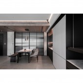
The living and dining rooms are connected into a wide field and are integrated with a view of the mountains coming in through large French windows. The kitchen area is designed with pocket sliding doors and a circulation around the island dining table so that it could have independent and connectable functionalities. With the subtle changes in the open layout, the different materials used on the ceiling in different areas properly divide and guide the movement of the space. The warm wire-brushed wood veneer adds visual tension to the living room, and with the reflective black mirror frame that introduces scenery into the room paired.
PROJECT DURATION AND LOCATION:
The project finished in October 2018 in Taipei, Taiwan.
FITS BEST INTO CATEGORY:
Interior Space and Exhibition Design
|
PRODUCTION / REALIZATION TECHNOLOGY:
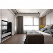
In this project, a large number of thin tiles are used in public spaces. The large, matte-surfaced thin tiles create a simpler and cleaner visual threshold for the public areas, and their characteristics also bring a conditioned touch to the residence. In order to make it simple but not dull, the designers utilized wire-brushed wood grain, titanium-plated metal, and reflective materials to decorate details. Some cabinet surfaces have also been replaced with special 3M films instead of paint to satisfy the overall visual enjoyment while still being environment-friendly and sustainable.
SPECIFICATIONS / TECHNICAL PROPERTIES:
The designers carefully checked the lighting conditions in this project directly embedded LED line lights in the ceiling of public areas with wooden construction methods to eliminate space for plenums and create a special design along the ceiling where light seems to flow in from the outside, perfectly balancing natural and artificial light sources. The designers created vertical grooves in the indoor corridors with panels and Japanese wall cloth and devised fine trimming details with titanium-plated metal.
TAGS:
Minimalism, Shrine design, Thin tiles, custom-made furniture, Color psychology
RESEARCH ABSTRACT:
Symphony of Lights is a residential design project within a building. The refined linear layers and the shades of chromatic present a unique beauty along with the calm and spiritual shrine. The designers ingeniously guide all kinds of light and interweave the changes of light and shadow in the space with the multi-colored ceiling design that enriches the texture of the space. The lowered central TV wall creates a versatile study, and paired with the custom-made cabinet made of woodwork and iron pieces, they give the public areas a wide range of possibilities.
CHALLENGE:
The designers replaced the traditional altar with suspended shelves and storage cabinets on both sides, and embedded lights on top instead of the traditional red lamps, and installed air exhaust designs to guide the flow of smoke rising from incense. In addition, in order to reduce the awkwardness of the shrine, the designers utilized traditional Chinese color psychology on the same facade, bringing forth a consistent yet unconventional space that perfectly satisfies the needs of faith.
ADDED DATE:
2020-06-22 10:25:53
TEAM MEMBERS (2) :
Yi Ta Lee, Chang Min Chen, Hung Chia YI and
IMAGE CREDITS:
Shiuan Tang Interior Design
|


