DESIGN NAME:
Hi Q Brown Algae Life Square
PRIMARY FUNCTION:
Exhibition Center
INSPIRATION:
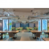
The client hopes to build the first platform in Taiwan that combines brown algae experience and social services. Before undertaking the designing of Hi-Q Brown Algae Life Square, the designer thoroughly studied the concept of the brand and the purpose of the space, set experience as the core value, and through pluralistic integration design methods and a smooth, harmonious space narrative, connecting the exhibition center, restaurants, classrooms, and R&D offices within the two-story venue.
UNIQUE PROPERTIES / PROJECT DESCRIPTION:
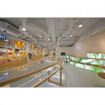
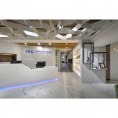
The exhibition center on the first floor serves as an experience area where fresh ingredients, facial masks, health supplements, pet medicines and food are sold. The designer used simple and gentle colors, beautiful and graceful organic curved lines to let the "sea" flow into space in an abstract form, reestablishing the conventional colors and cognition of the ocean, and at the same time accurately grasping the space ratio which perfectly and displays the characteristics of the product.
OPERATION / FLOW / INTERACTION:
Some of the original structure of the building was kept in the transition area between the staircases, supplemented by a highly penetrating wooden grille glass window, introducing abundant natural light, and a row of the neatly arranged bamboo forest not only satisfy the basic elements of space but also shape a poetic, beautiful scene. To support the cultural creativity of Taiwanese students, the walls are decorated with light blue lacquered glass which serves as a display wall, with a white frame that forms a painting-like scene.
PROJECT DURATION AND LOCATION:
The project was finished in May 2019, in Songshan District, Taipei City, Taiwan.
FITS BEST INTO CATEGORY:
Interior Space and Exhibition Design
|
PRODUCTION / REALIZATION TECHNOLOGY:
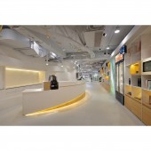
The wall surface of the exhibition center is decorated with diatomite imitation coating which gives them a detailed texture and intriguing visual changes. Accompanied by seaweed patterns, they compose a comfortable and relaxing atmosphere. The reception counter in the restaurant is made of special gold glaze glass, and the imported wallpaper is used in the back to shape the natural beauty like layered rocks and splashing ink.
SPECIFICATIONS / TECHNICAL PROPERTIES:
Drawing inspiration from the R&D personnel extracting fucoidan with molecular science technology and developing a variety of health supplements, the designer used woodworks and latches to imitate the shape of brown algae molecules, then use steel bars to hang them up to pay tribute to the R&D personnel's trail-blazing research and development technology.
TAGS:
Modernism, Exhibition Center, Ocean, Mix and Match, Eco-friendly
RESEARCH ABSTRACT:
The designer captured key elements of the ocean and used multiple methods to make the respective areas stand out yet follow the overall theme at the same time. The exhibition center on the first floor also serves as a product experience area. Space consists of simple design and warm colors, presenting fresh and elegant modernity. The ceiling is made of wood to create elegant flowing lines and curves, fast and slow, followed by a variety of light and shadow, forming a natural and free-flowing image of sea currents.
CHALLENGE:
For the designer, designing must be market-oriented. In addition to aesthetics, the unification of spatial images is even more crucial so that the owner could convey a clear message to consumers. Since this project includes a combination of an exhibition and sales center, a restaurant, offices, classrooms, etc., connecting the brand's market positioning and spiritual concept through the overall style, layout, and circulation to enhance the customer's memory, win their trust, and satisfy their experiences is the ultimate test on the designer's aesthetics and ability to integrate.
ADDED DATE:
2020-06-22 09:17:11
TEAM MEMBERS (1) :
CHUN-YING LAI
IMAGE CREDITS:
CHUN-YING LAI
|
