DESIGN NAME:
Staff House
PRIMARY FUNCTION:
Accommodation
INSPIRATION:
The inspiration of this project comes from the vibrancy of the city,it is different from ordinary accommodation living area. Besides the fundamentals of dwelling,designers place great emphasis on the artful expressiveness and emotional interaction, hope all people can get more relax and surprise in this space.
UNIQUE PROPERTIES / PROJECT DESCRIPTION:
Staff House is designed for the people who are employed by LILANZ. The fast pace of modern urban life makes it easy for people to feel heavy pressure under the tidal style of life. LILANZ hopes their employees could find a suitable life in this comfortable environment.
OPERATION / FLOW / INTERACTION:
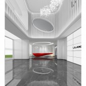
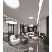
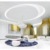
The reception hall on the first floor is dominated by the white tone to create a minimalist entry space. The red reception desk in the lobby lights up the whole space, bringing about a spatially unique and tensioned mood. The neat and precise streamlined and curved design gives the edged space a sense of fluency. The restaurant area adds a few blue and yellow elements to create a sense of the sea. By extending the streamlined design, it adds a sense of the future and technology to the restaurant.
PROJECT DURATION AND LOCATION:
The project was located in FuJian, China.
FITS BEST INTO CATEGORY:
Interior Space and Exhibition Design
|
PRODUCTION / REALIZATION TECHNOLOGY:
In this case, designers adopt a vertical design to solve the problems of unreasonable spatial layout, low floor height and short hallway in the original framework of architecture and increase the utilization of the space. Beside, concise and creative lighting are designed to add bright rays to the space and create a modern and cozy atmosphere.In the planning of spatial layout, the designers take an open stance to offer the whole space with more flexible and a wide view.
SPECIFICATIONS / TECHNICAL PROPERTIES:
Total Area : around 10000 square meters
TAGS:
Accommodation, Space, Interior, White, Marble
RESEARCH ABSTRACT:
In the selection of materials, the designers follow the principle of simplicity and practicality, to reduce unnecessary material and energy consumption. They replace composite plates with synthetically processed metals, to reduce the emission of harmful substances, increase permeability, and make the environment safe, comfortable and pleasant. The design is minimalist but not simple, as it comes more from the innermost emotional experience of modern people.
CHALLENGE:
Since the architecture was originally designed to have an unreasonable layout, low floor height and short hallway, it looks crowded in space with a poor lighting condition. The case is to adopt a vertical design to solve the problem of floor height and make better utilization of space. It is coupled with a concise, creative lighting design to add bright rays to the space and create a modern and cozy atmosphere. In the planning of spatial layout, the designers take an open stance to make the whole space more flexible. It also appeals to diversified soft furnishings to endow artistic colors to the entire space.
ADDED DATE:
2020-06-22 08:09:25
TEAM MEMBERS (1) :
Chen Shaoqun
IMAGE CREDITS:
Chen Shaoqun
|


