Twilight Interior Design by Dot Dot Studio and Process Ltd. |
Home > Winners > #106785 |
 |
|
||||
| DESIGN DETAILS | |||||
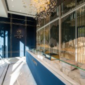
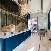
| DESIGN NAME: Twilight PRIMARY FUNCTION: Interior Design INSPIRATION: The Goal: To create an overall experience with the product, where the space plays an important role. The Method: Reflections on metal lattices create a sense of illusion where nature imagery and reality intertwine The Impact: To create a leisure space and bring healthy concepts to the neighboring communities. UNIQUE PROPERTIES / PROJECT DESCRIPTION: The project aims to create a spatial narration, through which customers have come to understand the story behind the beverage they drink as well as the provenance of ingredients. The store is designed to serve one group of clients at a time, encouraging them to appreciate the product with all the senses and feel its worth with the heart. The overall experience helps to facilitate not only interaction between people but also spiritual conversation between human among alternative spaces. OPERATION / FLOW / INTERACTION: In response to today's health-conscious society, the product aims to put emphasis on the trusting relationship between people. We believe that the simpler the product, the stronger the message behind it should be. Through a seemingly authentic cup of chicken essence, the brand attempts to inspire customers to experience the traditional culture and healthy philosophy, in the meantime, appreciate the natural and aesthetic environment. PROJECT DURATION AND LOCATION: The Interior project started in March 2018 and finished in March 2019 in Taipei, Taiwan. FITS BEST INTO CATEGORY: Interior Space and Exhibition Design |
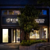
PRODUCTION / REALIZATION TECHNOLOGY: We use high reflectivity of metal and mirror to create a sensual world. It is multi-dimensional and pervasive. The main source of illumination feels as warm as the Sun and stars, mimicking the warmth that chicken essence brings to the body and soul. From afar, mountains glitter gold in the Sun. Sapphire blue velvet and marble floor are intersected by golden lines as if rays of light, guiding the eye to the brand’s logo. As the centerpiece of the store, the sapphire blue counter appears to float on the marble ground, adding a sense of distinctiveness to the product. SPECIFICATIONS / TECHNICAL PROPERTIES: 42 Meter Square TAGS: Interior, Design, Primona, Commercial, Healthy, Beverage RESEARCH ABSTRACT: Through contemporary design, we attempt to evoke a sense of being surrounded by nature during the 30-minute beverage experience provided by the store. Customers’ attention is guided by the contrasting color palette that dominates the storefront into the center of the interior. Inside, large titanium lattices reflect the hubbub of city streets, and at the same time, invoke longing for nature in people’s mind. Desire, imagination and reality intertwine, creating a kaleidoscope of reflections and imagery. CHALLENGE: It is a bold project, trying to make customers understand the history and culture behind the traditional brand over a 65ml cup of beverage. The space plays an important role. It flows and reflects like rays of golden light, recalling the nourishing nectar of chicken essence. We have created an astonishing space. It is warm and impressive like the product, converting those who have experienced it into endorsers. ADDED DATE: 2020-06-19 08:35:22 TEAM MEMBERS (2) : Director of Design: Min-Chin HSU and Designer: Hsiao-Chieh CHOU IMAGE CREDITS: Dot Dot Studio and Process Ltd., 2020. |
||||
| Visit the following page to learn more: https://www.dotdot-studio.com | |||||
| AWARD DETAILS | |
 |
Twilight Interior Design by Dot Dot Studio and Process Ltd is Winner in Interior Space and Exhibition Design Category, 2020 - 2021.· Read the interview with designer Dot Dot Studio and Process Ltd. for design Twilight here.· Press Members: Login or Register to request an exclusive interview with Dot Dot Studio and Process Ltd.. · Click here to register inorder to view the profile and other works by Dot Dot Studio and Process Ltd.. |
| SOCIAL |
| + Add to Likes / Favorites | Send to My Email | Comment | Testimonials | View Press-Release | Press Kit |
Did you like Dot Dot Studio and Process Ltd's Interior Design?
You will most likely enjoy other award winning interior design as well.
Click here to view more Award Winning Interior Design.


