DESIGN NAME:
Gray Territory
PRIMARY FUNCTION:
Commercial Space
INSPIRATION:
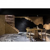
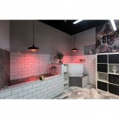
Believing that commercial space planning focuses on spatial layout and value, in response to this case, the design team brought a new look to this pet grooming project center with a unique space aesthetics, and chose gray as the main color to present a modern and simple design language; and the photo studio in the basement provides a creative space for taking pictures after the pet grooming.
UNIQUE PROPERTIES / PROJECT DESCRIPTION:
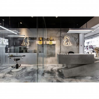
In response to the limited spatial pattern of the site, the design team utilizes colors and glass interface to extend the visual effect. The atmosphere created by the lighting and the use of composite media has enriched the beauty of the space and shows the uniqueness of this pet grooming center.
OPERATION / FLOW / INTERACTION:
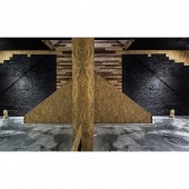
In response to the narrow and long space, the design team re-planned the layout so it will become more dynamic. The round layout on the first floor effectively reduced the waste of fragmented space, while the space of the ground floor eliminated the planning of the compartments, and is configured in a spacious layout to create an independent space to do pet shooting after grooming.
PROJECT DURATION AND LOCATION:
The project finished in August 2017 in New Taipei City, Taiwan.
FITS BEST INTO CATEGORY:
Interior Space and Exhibition Design
|
PRODUCTION / REALIZATION TECHNOLOGY:
Cultural stone, Wood fiberboard, EPOXY, Exquisite coating paint, Mosaics
SPECIFICATIONS / TECHNICAL PROPERTIES:
The floor area is approximately 76 square meters and the layout is divided into a welcoming area, working area, and employee lounge.
TAGS:
Industrial style, Cultural stone, Pet shop, Commercial space, Wood elements, Creative space, Interior design, Space design, Taiwan, Design brand.
RESEARCH ABSTRACT:
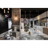
The design team used gray-scale tones and injected the contrast between black and white colors. The lighting design and different materials are used to provide an industrial style of commercial space. In order to increase the visual aesthetics of the space, the design team uses EPOXY as the main floor material. The floor is designed with a flowing effect to enrich the aesthetics of the space. The black wall space retains the texture of the original building, exposing the main essence of the building, and the surface is sprayed with black stone paint which gives another expression of industrial style design.
CHALLENGE:
This project has many configurations which are a challenge for the design team. Firstly, the irregular shape of the stone of the receptionist counter is extended from the gorgeous marble counter design. After several configurations, the design team chose to complete the imitation stone cut surface to improve the movement or handling inconvenience during the process. In addition, the curved cultural stone wall surface in the reception area was also a challenge during the construction process. After the precise design and measurement, the design team gradually completed the flat wall design and brought out an antique beauty to the waiting area.
ADDED DATE:
2020-06-18 01:45:22
TEAM MEMBERS (1) :
Tsung-Ju Wu
IMAGE CREDITS:
MK INTERIOR DESIGN ENGINEERING CO., LTD.
|
