DESIGN NAME: Silk Eclipse
PRIMARY FUNCTION: Commercial Space
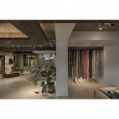
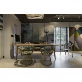
INSPIRATION: Corresponding to the high-level texture of the product itself, this space also follows the high-end design style in the overall planning. From the exterior wall to the interior space planning, white space is provided to create a comfortable space atmosphere. The herringbone style parquet floor is used on the ground to enhance the three-dimensional feeling, enlarges the field of vision.
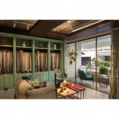
UNIQUE PROPERTIES / PROJECT DESCRIPTION: This project is a place for customers to participate in material selection. When the client personally selects diamonds for the counter decoration, the client unexpectedly saw all the diamond-cut faces of the crystal, adding a gorgeous appearance to the original black and white counter. In addition, the layout of this project, the ceiling design, and the lighting configuration are presented in a way that enlarges the vision to provide a comfortable and spacious shopping experience.
OPERATION / FLOW / INTERACTION: Considering that the original entrance was too close to the opposite neighbor, and the site is located in a triangle intersection, the design team readjusted the gate position, changed the facade to a diagonal entrance with ramp, a variety of material combinations are used to create a high-level space atmosphere.
PROJECT DURATION AND LOCATION: The project finished in August 2017 in New Taipei City, Taiwan.
FITS BEST INTO CATEGORY: Interior Space and Exhibition Design
|
PRODUCTION / REALIZATION TECHNOLOGY: Marble, Herringbone Parquet, Oakwood, LED, FRP, 3D paint
SPECIFICATIONS / TECHNICAL PROPERTIES: The floor area is approximately 118 square meters, and the layout consists of welcome are working area and employee lounge.
TAGS: Leisure style, Commercial space, Soft and hard materials, Herringbone parquet, Fresh and natural, Interior design, Space design, Taiwan, Design brand
RESEARCH ABSTRACT: Evolution, reviving the origin of space, as the goods sold by the client, the design presents a high-quality feature from the exterior design. The decorations used above the entrance area are painted with lacquered paint and utilize hard materials to show the soft look of the fabric. The design of the entrance light is quite fancy, by stepping into the door is like entering another space just like a fairy tale. The leisure design aesthetics provide customers with a comfortable and spacious shopping experience.
CHALLENGE: Since the client believes in Feng Shui, while planning this project it was a challenging experience since the design team needs to achieve a balance between the Feng Shui concept and modern design aesthetics. In addition, the design of the signboard is also shaped like a piece of fabric.
ADDED DATE: 2020-06-17 09:39:32
TEAM MEMBERS (1) : Wu, Tsung-Ju
IMAGE CREDITS: MK Interior Design
|