DESIGN NAME: Vitartissimi Natural Fragrance
PRIMARY FUNCTION: Package
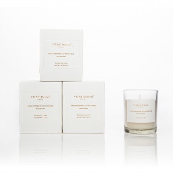
INSPIRATION: VITARTISSIMI is a natural and artistic lifestyle brand. The packaging is designed for the line of nature essential oil fragrance candle. The candles are handmade and 100% pure, thus, to share its health benefits. The design of packaging is based on market of natural product, to make it closer to fans of naturalism, also, to promote culture of brand in peace and quality lifestyle.
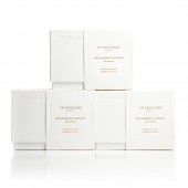
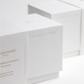
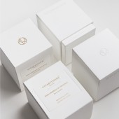
UNIQUE PROPERTIES / PROJECT DESCRIPTION: Thinking about the recycling, the packaging is in simple form. The box is without any prints but the uncolored logo and slogan, for reusing the box to do storage. We chose high quality materials which conform to FSC, to promote its social responsibility.
The fragrance is a very personal perception for different audience, so we remain the packaging in white color to make more space to imagine, and it will give softly impact by sense of smell after a smooth vision and touching.
OPERATION / FLOW / INTERACTION: This package uses artistic paper with excellent feel and hot stamping technology, which directly expresses the characteristics of VITARTISSIMI Natural Fragrance: nature and fragrance.
PROJECT DURATION AND LOCATION: The project started in April 2019 in Florence, Italy and finished in December 2019 in Suzhou, China.
FITS BEST INTO CATEGORY: Packaging Design
|
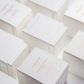
PRODUCTION / REALIZATION TECHNOLOGY: A packaging with “no color”, will give a impact when they show in a store, they are different from the others which are covered by so much prints or colors. The no color papers are cheaper than color papers in equal quality. With simple structure, it will realize its function of packaging as directive as possible. It’s easy to do transport, cubes help to save space and not easy to be flattened when they will be packed togather.
SPECIFICATIONS / TECHNICAL PROPERTIES: Dimensions:Width 82mm x Depth 82mm x Height 100mm
Techincal:Bronzing Process
TAGS: Package, Aromatherapy, Candle, Nature, Life
RESEARCH ABSTRACT: The box is designed uncolored logo and slogan in embossing, all the information of product are printed and pressed in bellyband, for reusing the box to do storage later. We are thinking more about the quality of this box, and make it not only like a packaging, but also a product, which could be used at home with simple aesthetics,it will make less waste and in order to lead the clients to use less of plastic boxes.
CHALLENGE: The design is conbined with a white box and a bellyband. The whole packaging is in white color, mostly used holi stamping and gold stamping. Follow the thinking of “less is more”,and with the branding idea, we remain the packaging in white color to make more space for imagination, and it will give softly impact by sense of smell after a smooth vision and touching.
ADDED DATE: 2020-03-30 07:10:21
TEAM MEMBERS (2) : Lu Jiayi, Art Director and Sha Feng, Creative Director
IMAGE CREDITS: Photographer by Lu Jiayi
Images by Sha Feng and Lu Jiayi, 2019
PATENTS/COPYRIGHTS: Copyrights belong to Suzhou SoFeng Culture Media Co.,Ltd. 2019
|