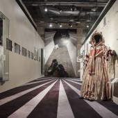
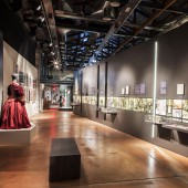
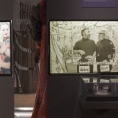
On Stage Theatre Museum Exhibition by Skevi Farazi |
Home > Winners > #104550 |
 |
|
||||
| DESIGN DETAILS | |||||
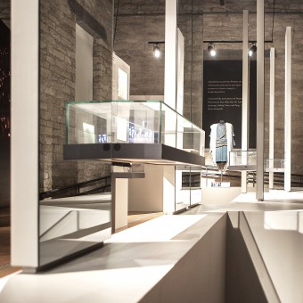
| DESIGN NAME: On Stage PRIMARY FUNCTION: Theatre Museum Exhibition INSPIRATION: Having as a reference the magic one experiences when watching a theatrical performance, the design aims to create a narrative space which evolves gradually as a 'theatrical plot’ in different ‘acts’. The transition from one section to the other is visually distinct allowing the surprise and the unexpected to escalate as in a theatrical play. Being on stage, backstage or in a dressing room were the main references for visual representations and interactive displays. UNIQUE PROPERTIES / PROJECT DESCRIPTION: 'On Stage' is the permanent exhibition of the Cyprus Theatre Museum. It aims to explore the different aspects of theatre in an experiential approach where boundaries of spectating and acting are intertwined. The exhibition unfolds in three parts: The History, a passage that acts as a filter of knowledge. The Contributors which showcases all aspects of the production which usually are unknown to the spectator. The Performance which as a final act reveals the final outcome. OPERATION / FLOW / INTERACTION: - PROJECT DURATION AND LOCATION: 2010-2012 Limassol - Cyprus FITS BEST INTO CATEGORY: Interior Space and Exhibition Design |
PRODUCTION / REALIZATION TECHNOLOGY: A central diagonal showcase splits the space in 3 sections and directs the visitors through wide and narrow paths, in a flow of pauses and transitions from one section to the other. It opens only to the final part and prevents thus the visual connection between the different sections. The entrance to the museum creates a play of knowledge through the reflections of mirrors, where the spectator, the graphics and displays dissolve their actual barriers in space and time. SPECIFICATIONS / TECHNICAL PROPERTIES: - TAGS: theatre, museum, exhibition, interior, design, showcase, stage, contributors, space, curation RESEARCH ABSTRACT: An elaborate research was done on precedent examples, the new trends of museology and the ways of communicating the information with different media. Various display systems, materials and colour palettes were explored so that all items could be displayed in a balanced design. The design was inextricably linked with the museological approach and developed in parallel with the exhibition material research until the final selection. CHALLENGE: The various materials of the existing space, such as natural stone on walls, timber roof, metal and concrete structures and big luminous windows needed to be approached with respect but on the same time without overshadowing the actual presentation of the exhibition items which demanded a dark space to allow them as such to be highlighted. The aesthetic balance between the exhibition design and the actual display object which by itself is ‘flamboyant’ was constantly tested. ADDED DATE: 2020-03-29 23:05:48 TEAM MEMBERS (5) : Designer: Skevi Farazi, Museologist: Sofia Antoniadou, Graphic Designer: Marika Ioannou, Audiovisual: Nicoleta Kalatha and Lighting Design: Dakis Sevastides IMAGE CREDITS: Image #1: Photographer Socrates Socratous, 2012 Image #2: Photographer Socrates Socratous, 2012 Image #3: Photographer Socrates Socratous, 2012 Image #4: Photographer Socrates Socratous, 2012 Image #5: Photographer Socrates Socratous, 2012 |
||||
| Visit the following page to learn more: http://www.skevifarazi.com/ | |||||
| AWARD DETAILS | |
 |
On Stage Theatre Museum Exhibition by Skevi Farazi is Winner in Interior Space and Exhibition Design Category, 2019 - 2020.· Read the interview with designer Skevi Farazi for design On Stage here.· Press Members: Login or Register to request an exclusive interview with Skevi Farazi. · Click here to register inorder to view the profile and other works by Skevi Farazi. |
| SOCIAL |
| + Add to Likes / Favorites | Send to My Email | Comment | Testimonials | View Press-Release | Press Kit |
Did you like Skevi Farazi's Interior Design?
You will most likely enjoy other award winning interior design as well.
Click here to view more Award Winning Interior Design.


