Flavour Funhouse Underground Shopping Mall by K11 Musea |
Home > Winners > #103104 |
 |
|
||||
| DESIGN DETAILS | |||||
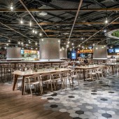
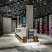
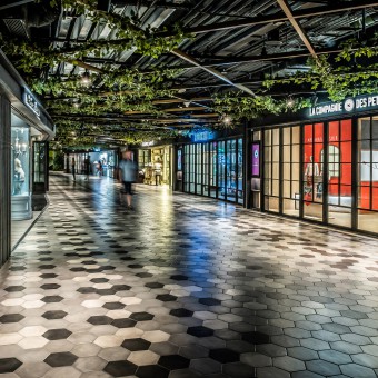
| DESIGN NAME: Flavour Funhouse PRIMARY FUNCTION: Underground Shopping Mall INSPIRATION: Taking inspiration from the Northern Galleria such in Italy with the iron and glass architecture, it is a balance of the homage to the past and the transit towards the future. Iron and glass architecture is predominant in the 19th century, paving a new trend of shopping space. The design has incorporated modernized feature of metal and glass for the shop front, creating a standard platform for the shops to present their brands personality while maintaining the unique DNA of the shopping mall. UNIQUE PROPERTIES / PROJECT DESCRIPTION: K11 aim to develop K11 MUSEA as Hong Kong most sophisticated museum retail space with millennial appeal, combining retail with a beguiling mix of craft, heritage, design and creativity. Thus, K11 constituted an artistic, theatrical spatial experience rather than a conventional shopping environment, where global millennials can come together to discover their muse. OPERATION / FLOW / INTERACTION: The food court occupies nearly half of the space in B2 level. As walking through the shops, the customer will reach the Food Playground. The seating is different in wooden colours and the chair designs are specially tailored for diversified groups of customers: the four remarkable structural pillars are arranged as bar setting for individuals or couples; small tables of four are scattered around the long wooden table for big families and friends. The vibe is relaxing and vibrant. PROJECT DURATION AND LOCATION: The project started in 2016 and finished in August 2019 in Hong Kong. FITS BEST INTO CATEGORY: Interior Space and Exhibition Design |
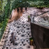
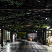
PRODUCTION / REALIZATION TECHNOLOGY: Designers filled the space with modern luxurious elegance. Under the high black metallic ceiling are three different floor tiles, including the hexagonal Cementine tiles that embody the charm of the Italian design, to demarcate different zones. The use of sliding doors in black grid for all shops gives the whole environment a homogeneous and timeless atmosphere. The materials were slick and sleek, a generous amount of space is dedicated to exhibit contemporary art pieces. SPECIFICATIONS / TECHNICAL PROPERTIES: Total floor area is 0.8m sqft TAGS: Victoria Dockside, K11 Musea, car park design, retail, art, art mall RESEARCH ABSTRACT: K11 team paid special attention to the arrangement of the seating. Conventionally the food courts aim at maximizing the number of seating to cater to the high traffic of customers. Here the team have studied the pattern of customers. As the site is located in the city center with numerous tourists, the customers usually come in as couple, family and groups of friends. Therefore the team have break up the seats with tables, benches or bars counter so that customer can enjoy their space as they like. CHALLENGE: Since the project is in the basement, the ceiling height is low because of architectural limitation. The team have tackled this issue by opening the ceiling to preserve the full height. All of the lights and decoration are secured by the metal grid, which create a chic diamond-shaped pattern on the ceiling. The lighting is warm and not particularly bright to achieve an intimate feeling in the common space, ensuring the shops on both sides are highlighted. ADDED DATE: 2020-03-03 02:32:35 TEAM MEMBERS (1) : Dr. Adrian Cheng Chi-Kong JP (New World Development Company Limited & K11) + Stefano Tordiglione (ST design) IMAGE CREDITS: Edmon Leong |
||||
| Visit the following page to learn more: https://www.k11musea.com | |||||
| AWARD DETAILS | |
 |
Flavour Funhouse Underground Shopping Mall by K11 Musea is Winner in Interior Space and Exhibition Design Category, 2019 - 2020.· Read the interview with designer K11 Musea for design Flavour Funhouse here.· Press Members: Login or Register to request an exclusive interview with K11 Musea. · Click here to register inorder to view the profile and other works by K11 Musea. |
| SOCIAL |
| + Add to Likes / Favorites | Send to My Email | Comment | Testimonials | View Press-Release | Press Kit |
Did you like K11 Musea's Interior Design?
You will most likely enjoy other award winning interior design as well.
Click here to view more Award Winning Interior Design.


