DESIGN NAME:
Discussion of Space
PRIMARY FUNCTION:
Tea Shop
INSPIRATION:
The "cool" and "funny" style requirements of the project, and the need to meet reproducible standardization are the challenges of this project, but also the source of inspiration. How to design a project in a standard system that meets the needs of a store with different functions and different storefrontsis the motivation of our thinking.Based on the relationship between human scale and space, and starting from the most basic form,it createsmulti-dimensional sensory experiences.
UNIQUE PROPERTIES / PROJECT DESCRIPTION:
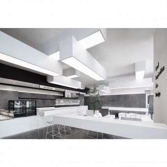
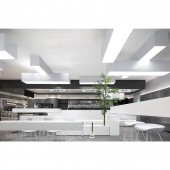
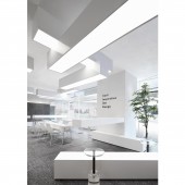
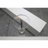
The project is located in Shenzhen, thedesigncapital in China, a new cultural and innovative city. In addition, the owner advocates artistic creation to make tea drinking a cooler and different brand concept, whichwill be the advantage of the project.Wealsotry to start from the most basic form and use a pure white block to create a unique suspended tea space. This is a brand newconceptualattempt tocreate more communication possibilities through rich spatial experience.
OPERATION / FLOW / INTERACTION:
-
PROJECT DURATION AND LOCATION:
Started on January, 2019;
Finished on April, 2019;
2nd Floor of Fangda City Mall, Beihuan Boulevard, Nanshan District, Shenzhen, China.
FITS BEST INTO CATEGORY:
Interior Space and Exhibition Design
|
PRODUCTION / REALIZATION TECHNOLOGY:
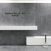
From the use of chairs, tables, and Lighting combined modulus, different materials are used according to different functional needs. If you want to use white furniture paint, you need more wear-resistant furniture paint. If white artificial stone is used for the countertop, special attention needs to be paid to waterproofness and seamlessness. And the white ceiling needs to choose environmental-friendly art paint. Since we want to make the space more three-dimensional, cleaner and cooler, gray terrazzo has been chosen as the base of the space for the floor and wall, which can set off the white shape. Under the blessing of time, the white blocks and the instantly changing lights pierce the boundaries of space. The spirit of freedom in this project has become more transparent and powerful through the changes of pure blocks and color relationships. Free combination and stitching make the space more interesting and create more communication possibilities for the users.
SPECIFICATIONS / TECHNICAL PROPERTIES:
Combining design, production, construction and functional requirements, the project formed from unit body modulus is its biggest feature. From multiples of 15 to 30, 45, 60... These values are closely related to industrial production technologies such as human engineering, space behavior, and materials science.
TAGS:
Cool, Block, Communication, Modulus, White
RESEARCH ABSTRACT:
-
CHALLENGE:
The time from design to completion is only two and a half months. How to design a project in a standard system that meets the needs of a store with different functions and different storefronts in the future is the motivation of our thinking. Different from the conventional layout of other stores, the new space should meet the needs of modern people in different status. The white lights and the blocks that dare to break the limits are reorganized horizontally and vertically by different angles and orientations. Double-folded blocks, the well-proportioned spatial layout, and the white box extending infinitely indoors and outdoors. All of these are started from the brand concept and person, and more attention is paid to the status and spatial experience of person in use.
ADDED DATE:
2020-02-28 09:23:26
TEAM MEMBERS (6) :
Team Members:, Encome , Matthew , Benson, Monte and Ray
IMAGE CREDITS:
UND Design Studio, 2019.
|
