DESIGN NAME:
Modern Blues
PRIMARY FUNCTION:
Residential Interior Design
INSPIRATION:
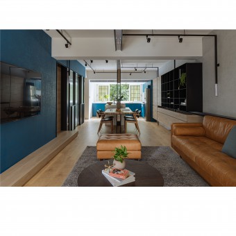
The layout of this long house, with only natural light from two sides, is rearranged. The different sections, including the master bedroom, the dining room, the dining room and the kitchen, as well as the study, are reshuffled, so that there is an open public area that serves as a flow connecting the living room, the dining room and the kitchen, making the entire space well-ordered and adding a visual sense of vastness.
UNIQUE PROPERTIES / PROJECT DESCRIPTION:
It is a renovated old house that not merely updates and enhances its exteriors but thoughtfully designs its layout and details such as lighting and storage. The old dwelling is thus better suited to fulfill modern designing ideas. Meanwhile, flexibility is reserved for future needs of the couple and their soon-to-arrive baby. A simple house is constructed as a result of designing aesthetics involving colors and materials.
OPERATION / FLOW / INTERACTION:
The eye-catching blue TV wall in the living room separates the master bedroom and the living room, and the door to the master bedroom and the guest bathroom are concealed on either side of the TV wall with sliding doors. In the way, the completeness of the TV wall is retained, while the large area of blue makes the wall look composed and easy on the eyes, setting the key tone for the entire space as well.
PROJECT DURATION AND LOCATION:
New Taipei City, Taiwan
FITS BEST INTO CATEGORY:
Interior Space and Exhibition Design
|
PRODUCTION / REALIZATION TECHNOLOGY:
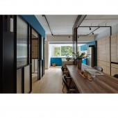
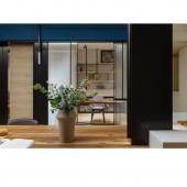
The study has a transparent sliding door for ready separation from other space. The open shelves and the peg board on the wall allow for sufficient storage for the study, which is not very big, without giving a sense of crowdedness. The wooden and iron details add modernity to it. Concealed behind the main wall of the living room is the master bedroom, whose walk-in closet made of a narrow long space with a transparent sliding door for division becomes the hostess’ favorite. Inside the walk-in closet are some tiered selves with some open space left, so that the room will not look cramped while meeting the need for storage.
SPECIFICATIONS / TECHNICAL PROPERTIES:
86 square meter
TAGS:
-
RESEARCH ABSTRACT:
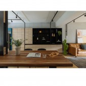
Parallel to the main wall, the black cast iron on the ceiling goes across the living room and the dining room, and then extends vertically to the dining room and the bar counter, in striking contrast with the white ceiling. Its end corresponds with its beginning, like the main them played on the cello, and is the host’s favorite. Both to the right and to the left, the track lights of the same black in place of incandescent and fluorescent ones, are more than enough to meet the lighting needs of the house, bringing sleek lines to the otherwise monotonous space. Leather and hard wood go perfectly well for the furniture, presenting a simple style that partakes of equilibrium and distinction.
CHALLENGE:
The dining room is an extension from the living room and connects the kitchen and the study on one side. An abundance of natural light is ushered in by means of the large windows in the kitchen and the transparent sliding doors to the study and the living room. The panels of the L-shaped counter and suspended cabinets in the kitchen are in the same blue that echoes that of the TV wall in the living room. This further highlights the white color of the counter and the wall, thereby making the kitchen look even cleaner and brighter. The bar counter and the sink at the center extend to the table in the dining room, making for a dining environment that is simple yet stately. The cupboard on one side is a display case of light-color wood. Without any handle, it has a simple appearance to act as future protection for the child soon to be born.
ADDED DATE:
2020-02-28 09:02:09
TEAM MEMBERS (1) :
I-Hao Chang
IMAGE CREDITS:
Photo / Eva Lee
|
