DESIGN NAME:
Slight Tipsy of Traveling
PRIMARY FUNCTION:
Bistro
INSPIRATION:
The style of the buildings and surroundings corresponds with the long history of the city. The designer manages to reconstruct time, space, and society, making an illusion of wandering on a path in Europe. Walking into the corridor with a dome, people can see the light spreading downwards from the curve surface onto the rock floor, while vibrant yellow flowers and green leaves reflect the nature. With the application of contemporary design, the true nature are wholly presented.
UNIQUE PROPERTIES / PROJECT DESCRIPTION:
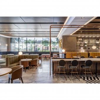
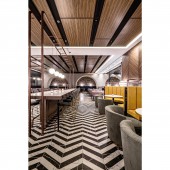
To provide an impressive experiences and to develop more functions in the dining areas, the designer ingeniously put lines and arcs together with a thorough plan to merge the diversity. Meanwhile, artistic elements are blended in through the mix of materials, furnishing, and the selection on colors. On top of that, a fluent flow is formed by arranging seats properly. Whenever the customers plunge into or get up of the seats, the high and low changes in visual perception bring the new experience.
OPERATION / FLOW / INTERACTION:
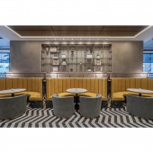
The designer presents a rich visual perception and organized space arrangement with a proper layout. Based on that, the core seating area is in a high and low combination that involves both bar and booth seating, providing people with different forms of seats that meet their need. As for color selection, green, yellow, blue, purple, and pink are baldly applied, carrying out various stimulations. It would be not only a great meal but also a feast to all of our perceptions.
PROJECT DURATION AND LOCATION:
This project was finished in 2019 in Tainan City, Taiwan
FITS BEST INTO CATEGORY:
Interior Space and Exhibition Design
|
PRODUCTION / REALIZATION TECHNOLOGY:
Stone Materials, Cement polishing, Red brick, Wooden veneer, Arrow tile, Metal elements, Cloth
SPECIFICATIONS / TECHNICAL PROPERTIES:
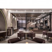
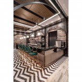
The project is 423 square meters. Metal elements are utilized to an extreme, forming a stylish and elegant environment with the sharp design and the color of the light. Bar by the entrance is framed with metal arches, with permeable metal grid panels, reducing the heaviness; while booth seating area builds up the cave-like feeling with cement finish, and they sit opposite one another, making a mirror image illusion. Besides, copper panels, bending into arcs, are applied to the lower part of the bar, again resonating with the theme, the arch.
TAGS:
Bistro design, Journey to Europe, Layers, Colors, Feast for the eyes
RESEARCH ABSTRACT:
The arch shape design is from metal chain-link fences and red bricks symbolizing a trip to Europe. Natural light and outdoor views come through the large panel window; the wall is decorated with pilling wood to build a cozy image of fireplace; the individual seating area, a cross-shaped green seating booth, and pink chairs are going with European street lamps and preparation counter decorated with vintage suitcases, constructing a situational journey to Europe.
CHALLENGE:
The challenge is how to present extraordinary taste and dining phenomena through mix of various materials and diverse furniture arrangement, and at the same time to strike a balance between all the objects, making a huge number of visual elements into a space in harmony.
ADDED DATE:
2020-02-28 04:43:52
TEAM MEMBERS (1) :
IMAGE CREDITS:
NEXT Design
|
