Type St Small Living Apartment Design by Jack Chen |
Home > Winners > #102036 |
 |
|
||||
| DESIGN DETAILS | |||||
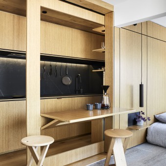
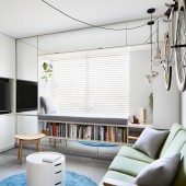
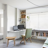
| DESIGN NAME: Type St Small Living PRIMARY FUNCTION: Apartment Design INSPIRATION: The design was inspired by the Tiny house movement, to create a home in a small footprint, a Swiss army knife of living, where everything one needs can be found in the small floor area. UNIQUE PROPERTIES / PROJECT DESCRIPTION: The project is the renovation and interior design of a small 33m2 1 bedroom apartment, with the intention to explore the idea of living small, the objective to fit a whole house into a small apartment. The final outcome is a 1 bedroom apartment, that also doubles as an office for the occupant during the day time. An abstract timber box is inserted that extend the whole length of the apartment, creating an animated backdrop to an otherwise white apartment space. Within the timber box contains numerous functions as the kitchen, the bathroom, the laundry, the entry foyer, mini cellar, and even the dining space. It also provides the backdrop timber bedhead to the bedroom. A timber bathroom is at the very end of the apartment, access via a secret door via the bedroom, it also connects with the kitchen via a new window insert to bring in natural light to the kitchen, with privacy achieved by a switchable frosted privacy film on the window glazing. At the end of the bathroom is a feature green moss wall. It is aligned at the front door; it sets the inviting atmosphere of the apartment the moment the occupant walks through the front door, as well creating illusion of an outdoor space, which the existing apartment lacks. The rest of the apartment is white and paired back, this includes the living room and bedroom. A function wall divides the 2 space, the wall provides the sliding door that divides the 2 spaces, but also hides the TV, and even the folding desk for office operation. Full height built in wardrobe is at the end of the apartment and the bedroom. It blends with the white backdrop to create a sense of space and de-clutters. OPERATION / FLOW / INTERACTION: The apartment is designed with all the function and luxury one would expect for a home, in order to achieve this in a small footprint and not to feel over cluttered, different functions will appear, disappear and overlap one another as needed. This is achieved by flexible furniture that can appear or disappear via folding, sliding and various other ways of interaction. The home also needs to function as an office space in the daytime. The study nook, along with office equipment such as computers and printers are hidden away in the living room. During the day, the study table is folded out, exposing the computer accessories, even the lounge chair converts to a study chair configuration. Then at night, the table is folded away, and lounge chair returns to its relaxed configuration. The dining table is another major function that are hidden away until use. As a house designed for 1 or 2, the dining table is not used frequently, so this was designed to be completed hidden away when not in use. This is achieved by an origami like dining table, that slides out from the wall and then folded down to produce a table for 2, up to 4 can be used for small gatherings when required. The dining stools are also typically folded away and stored on the wall and only comes out as needed. To achieve all the functions requirements, most of the items will need to have 2 different configurations, to suit different purposes. The window between the bathroom and kitchen, for example, as required to let the light to the kitchen area, a layer of privacy film is added to the glass, on the switch of a button, the glass will go from clear to frosted to provide the privacy required for the bathroom. To help reduce the potential awkwardness of seeing from kitchen to bathroom, a green wall is introduced to the bathroom wall, to create a visual feature when view from kitchen. PROJECT DURATION AND LOCATION: The project is located in Richmond, Victoria Australia. The renovation took around 4 month to complete, starting from July 2016. FITS BEST INTO CATEGORY: Interior Space and Exhibition Design |
PRODUCTION / REALIZATION TECHNOLOGY: The design was done in 3D modelling in Sketchup, and the same 3D model was used instead of conventional 2D CAD drawings to communicate with the cabinet maker on the boutique design details, as the customized detail requires brand new understanding than what the cabinet maker was previously used to. The end production was produced predominately in factories, where ample space and tools are readily available, then bought together to be assembled onsite. SPECIFICATIONS / TECHNICAL PROPERTIES: Floor area: 33m2 Dimension: 7.2m(length)x4.6m(wi TAGS: interior, apartment, renovation, smallfootprint, smallliving, home RESEARCH ABSTRACT: Japanese design and minimal living philosophy are a part of the research behind the design. The idea to live simply with less, with less possession, but also mindful of what is important to you. The design is trying to combine warmth and comfort with minimal approach, trying to avoid the stark images that are often associated with minimalism. CHALLENGE: The existing condition was quite limiting so the challenge for the project was to turn all the constraints to its design inspiration. The constraints include the small apartment footprint, of only 33m2, combining with a low ceiling height of 2.4m. There’s no outdoor space. The apartment was without a working kitchen, and the only north facing window (best sunlight orientation in Australia) is in the bathroom. The challenge was to work with these limitations, to create something comfortable and inviting, and practical in operation. ADDED DATE: 2020-02-28 01:23:15 TEAM MEMBERS (1) : Jack Chen IMAGE CREDITS: Tess Kelly Photography |
||||
| Visit the following page to learn more: https://www.tsaidesign.com.au/ | |||||
| CLIENT/STUDIO/BRAND DETAILS | |
 |
NAME: tsai Design PROFILE: - |
| AWARD DETAILS | |
 |
Type St Small Living Apartment Design by Jack Chen is Winner in Interior Space and Exhibition Design Category, 2019 - 2020.· Read the interview with designer Jack Chen for design Type St Small Living here.· Press Members: Login or Register to request an exclusive interview with Jack Chen. · Click here to register inorder to view the profile and other works by Jack Chen. |
| SOCIAL |
| + Add to Likes / Favorites | Send to My Email | Comment | Testimonials | View Press-Release | Press Kit |
Did you like Jack Chen's Interior Design?
You will most likely enjoy other award winning interior design as well.
Click here to view more Award Winning Interior Design.


