SberBank Online Mobile Banking Application by SberBank Online Design Team |
Home > Winners > #101823 |
 |
|
||||
| DESIGN DETAILS | |||||
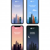
| DESIGN NAME: SberBank Online PRIMARY FUNCTION: Mobile Banking Application INSPIRATION: SberBank Online team aim to offer to clients banking with a human face and build a strong connеction with clients by stimulating positive emotional experiences wherever it is organic. To make money transfers more human and emotional, SberBank Online team implemented colorful postcards and stickers to accompany money transfers. For transactions which take long, team designed special animation screens to entertain clients while they are waiting. SberBank Online app also has personalized designs of the main and welcome screens depending on the location of the customer and time of the day. UNIQUE PROPERTIES / PROJECT DESCRIPTION: SberBank Online app allows users to get online almost all banking products of the largest Russian bank. Besides traditional banking services there are lifestyle features in SberBank Online such as chats, stories, catalogue, etc. Emotional and emphatic design of the app supports the idea of breaking the pattern of a conventional banking app. SberBank Online team strongly believe that UE (User Emotions) is the new Must-Have for all digital product designs. OPERATION / FLOW / INTERACTION: There are a lot of apps today to cover one need. Almost all of them have solid UX and UI, but SberBank Online team believe that only those who also care about User Emotions will win the customers’ attention in the end. Average customer who sends money transfers with stickers and postcards compared to those who does not, do it 33% more frequently and overall amount of the money sent is 10% larger. In the year when personalization of SberBank Online appeared, the app appeared in top-3 most downloaded (in Russia) apps in the App Store following Whats App and Instagram. PROJECT DURATION AND LOCATION: In 2012 SberBank Online was launched for iPhone and Android. The new version of the SberBank Online app with personalization and emotional design was launched in 2019. Nowadays client experience is continuously improving by studying customers’ behaviour. |
PRODUCTION / REALIZATION TECHNOLOGY: Illustrations were designed in After effect CC, Illustrator CC and Adobe Photoshop CC. Lottie libraries and plugins were used. The interface part of the app is designed in Sketch. Emotional design part of the app was built using Swift for iOS, using Kotlin for Android. Targeting and geotags are used to show personalized designs to the right customers. SPECIFICATIONS / TECHNICAL PROPERTIES: Above iOS 10.0 / Above Android 10.0 TAGS: Digital Banking, Personalization, Emotional Design, app. RESEARCH ABSTRACT: The feature of adding short comments to money transfers has always been available in SberBank Online and via SMS bank and 20% of clients never left the text field empty. Millions of SMS daily were sent with money transfers. Literally it means that money transfers became part of everyday communication. In reaction to this finding, SberBank Online team launched a chat form factor in app with postcards, stickers, chat groups and other money features. CHALLENGE: One of the brightest challenges which emotional design helped us solve was a long loading in the app. Banking apps do need a lot of data to upload, but SberBank Online team cannot control some circumstances like slow internet connection. Now in situations like this, the app users see a cute animated terminal with blushing cheeks instead of a white loading screen. SberBank Online team managed to turn a potentially negative issue to completely the opposite — app never received so many 5-star rates in the app stores for our design! ADDED DATE: 2020-02-27 15:23:58 TEAM MEMBERS (1) : IMAGE CREDITS: SberBank Online Design Team, 2020. |
||||
| Visit the following page to learn more: https://apps.apple.com/ru/app/сберб |
|||||
| AWARD DETAILS | |
 |
Sberbank Online Mobile Banking Application by Sberbank Online Design Team is Winner in Mobile Technologies, Applications and Software Design Category, 2020 - 2021.· Read the interview with designer SberBank Online Design Team for design SberBank Online here.· Press Members: Login or Register to request an exclusive interview with SberBank Online Design Team. · Click here to register inorder to view the profile and other works by SberBank Online Design Team. |
| SOCIAL |
| + Add to Likes / Favorites | Send to My Email | Comment | Testimonials | View Press-Release | Press Kit |
Did you like Sberbank Online Design Team's Mobile Design?
You will most likely enjoy other award winning mobile design as well.
Click here to view more Award Winning Mobile Design.


