Si Me Quiero Web Design and UX by Ana Ramirez-Marta Liarte |
Home > Winners > #101702 |
 |
|
||||
| DESIGN DETAILS | |||||
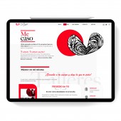
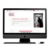
| DESIGN NAME: Si Me Quiero PRIMARY FUNCTION: Web Design and UX INSPIRATION: The client wanted it to be simple and clean, so since the use of color was a two-tone range the inspiration came from the constructivist design, its way of placing texts and the use of square shapes in space. UNIQUE PROPERTIES / PROJECT DESCRIPTION: The website Si, Me Quiero, it is a space created to love oneself. This is a safe space where to be oneself. A trial-free website where we practice Zero Requirement and love for oneself. The web is an accompaniment, and it simply leads to an approach. The colors are neutral contrasted with the red that calls for certain actions. The design is simple for you to travel through the sections cleanly and is accompanied by a deck of cards that when you click gives us a message to encourage us. OPERATION / FLOW / INTERACTION: Upon landing on the promotion website, visitors are greeted with an image of a woman hugging a heart. The website uses the artistic use of white and gray interspersed with red pieces and solvents to embody the idea of spiritual and peaceful introspection. Visitors can find useful project information on this functional but elegant website. The deck of cards with self-help messages are an interesting point of the web. PROJECT DURATION AND LOCATION: The project started at the end of Octiber 2019 in Bilbao and finsihed at the end of February 2020. |
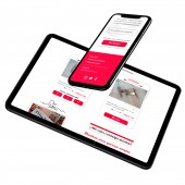
PRODUCTION / REALIZATION TECHNOLOGY: Understand, design, evaluate and execute. The solution evolved through concepts, rapid prototypes, user evaluations and execution.There is a lot of research done on this application before the design process. Adobe XD, Illustrator and Photoshop are used to create the actual design and designs. In addition, the team conducted an in-depth analysis and investigation of data to ensure that the design focuses on the user. SPECIFICATIONS / TECHNICAL PROPERTIES: The site was given a fully responsive design to work well over multiple screen sizes, tablets and devices. TAGS: Responsive, website, design, responsive, Digital Transformation, Content, social change, Strategy,User Interface Design RESEARCH ABSTRACT: The process began in the first searches of references of external sites and brand reference. Then we researched more about the user and their goals, made character files, scenarios and information architecture. From this, wire schemes were created that were later transformed into visual materials in Adobe XD and Photoshop. CHALLENGE: The main obstacle was to overcome the mental and social barriers of the project, since it can be linked to feminism and is not what was wanted. Presenting it as something external to a social movement but as an aid that transforms people's lives was the most difficult. ADDED DATE: 2020-02-27 11:59:35 TEAM MEMBERS (3) : UX / UI Designer: Ana Ramirez, Layout: Marta Liarte and SEO: conquer the internet IMAGE CREDITS: Ana Ramirez-Marta Liarte, 2019. |
||||
| Visit the following page to learn more: http://simequiero.com/ | |||||
| AWARD DETAILS | |
 |
Si Me Quiero Web Design and Ux by Ana Ramirez-Marta Liarte is Winner in Website and Web Design Category, 2019 - 2020.· Read the interview with designer Ana Ramirez-Marta Liarte for design Si Me Quiero here.· Press Members: Login or Register to request an exclusive interview with Ana Ramirez-Marta Liarte. · Click here to register inorder to view the profile and other works by Ana Ramirez-Marta Liarte. |
| SOCIAL |
| + Add to Likes / Favorites | Send to My Email | Comment | Testimonials | View Press-Release | Press Kit | Translations |
Did you like Ana Ramirez-Marta Liarte's Web Design?
You will most likely enjoy other award winning web design as well.
Click here to view more Award Winning Web Design.


