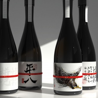
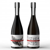
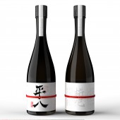
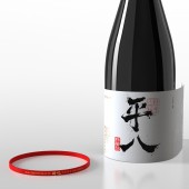
Pingba Sake Wine Sake by Zhanqiang Yang |
Home > Winners > #101594 |
| CLIENT/STUDIO/BRAND DETAILS | |
 |
NAME: going design PROFILE: Drawing original, customizing new product ShenzhenGoingBrandPackagingDesignCo.,Ltd is located in Shenzhen design capital, is a new generation of international artistic temperament, broad design vision of the professional design institutions In the past ten years, many domestic enterprises have been providing brand full case development and design service, new product upgrade design service, brand master image upgrade service and later brand packaging material production and processing, complete product supply chain one-stop service, for many new enterprises to solve design difficulties, and at the same time to the old brand new energy! it has a talent and artistic temperament, can make brand products and commodities fusion perfect landing of the elite team. it also could provide you with a better 360-degree close design, efficient full-line service! |
| AWARD DETAILS | |
 |
Pingba Sake Wine Sake by Zhanqiang Yang is Winner in Packaging Design Category, 2019 - 2020.· Read the interview with designer Zhanqiang Yang for design Pingba Sake Wine here.· Press Members: Login or Register to request an exclusive interview with Zhanqiang Yang. · Click here to register inorder to view the profile and other works by Zhanqiang Yang. |
| SOCIAL |
| + Add to Likes / Favorites | Send to My Email | Comment | Testimonials | View Press-Release | Press Kit |
Did you like Zhanqiang Yang's Packaging Design?
You will most likely enjoy other award winning packaging design as well.
Click here to view more Award Winning Packaging Design.


