KP.A Exhibition Space by 5+2 Design Perceptron Design Group |
Home > Winners > #101566 |
 |
|
||||
| DESIGN DETAILS | |||||
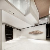
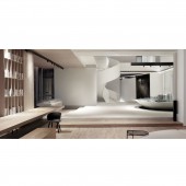
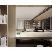
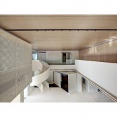
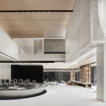
| DESIGN NAME: KP.A PRIMARY FUNCTION: Exhibition Space INSPIRATION: At the foot of the Dashu Mountain in Hefei, Anhui in the 1980s, it was still a piece of farmland that could be harvested in autumn. Now replaced by the "concrete forest", it has become a fragment of memory in the past. Architectural planning is generated from old grain land. Today, with the rapid economic development and improvement of living standards, what kind of lifestyle is sold on the land that has been nurtured for generations, and what kind of viewpoints are needed to state the design. UNIQUE PROPERTIES / PROJECT DESCRIPTION: An exhibition space selling lifestyles from the cereal land. When the volume is not the benchmark, the house and chairs and other daily necessities are essentially basic living needs. The way of presenting the space in the room, through the volume variable of the cube, progresses to the area of different functional attributes, forming rich function settings and random moving guides, minimizing the commercial intention of the venue and relaxing the spatial mood. OPERATION / FLOW / INTERACTION: The artistic atmosphere of space is never separated from the practical attributes of space. Minimalist collocation, exquisite composition, bright light and shadow relationship together create a space of stereoscopic science and beauty. Both internal and external, and creative collection. The exterior decoration logo, rigorous and exquisite three-dimensional architectural style, creates a unique visual impression, and the layered internal space lining shows a soft and delicate atmosphere. There are all kinds of art, and the technique is endless. PROJECT DURATION AND LOCATION: The project is located in Hefei, China. The design of the project began in February 2019 and was completed in July of the same year. FITS BEST INTO CATEGORY: Interior Space and Exhibition Design |
PRODUCTION / REALIZATION TECHNOLOGY: The space uses a large area of wood materials to continue the connection and narrative of the concept of the grain crop. The definition of the shape is based on the understanding of the functional area, so that the generation of space is more simple, and it is more inclined to understand the building on the basis of pragmatism, And the switching and integration of space. SPECIFICATIONS / TECHNICAL PROPERTIES: About 1000 squate meters TAGS: A:Art exhibition, B:Ritual sense of art, C:Environment-frie RESEARCH ABSTRACT: The way of presenting the space in the room, through the volume variable of the cube, progresses to the area of different functional attributes, forming rich function settings and random moving guides, minimizing the commercial intention of the venue and relaxing the spatial mood. For the space, There are no statement of too much styling attributes, The relationship between the spaces is formed by the definition of the attribution between the planning moving line and the space. CHALLENGE: We would like to emphasize the products itself in our lives. In the interior we did not use a lot of colour. Basic on these point of view, The idea of understanding the same properties of industrial products such as house products and chairs. Flat display by carrier in the form of a highly compatible art gallery , It can guide customers to understand the concept of residential products and their future life in a multi-dimensional way. ADDED DATE: 2020-02-27 08:06:50 TEAM MEMBERS (1) : Designer: Yongqiang Yi IMAGE CREDITS: Main Image and Optional Image #1#2#3#4 Photographer 5+2 Studio |
||||
| Visit the following page to learn more: http://www.5plus2.com | |||||
| AWARD DETAILS | |
 |
Kp.a Exhibition Space by 5+2 Design Perceptron Design Group is Winner in Interior Space and Exhibition Design Category, 2019 - 2020.· Read the interview with designer 5+2 Design Perceptron Design Group for design KP.A here.· Press Members: Login or Register to request an exclusive interview with 5+2 Design Perceptron Design Group. · Click here to register inorder to view the profile and other works by 5+2 Design Perceptron Design Group. |
| SOCIAL |
| + Add to Likes / Favorites | Send to My Email | Comment | Testimonials | View Press-Release | Press Kit |
Did you like 5+2 Design Perceptron Design Group's Interior Design?
You will most likely enjoy other award winning interior design as well.
Click here to view more Award Winning Interior Design.


