Kuniichi Food Package by Katsunari Shishido |
Home > Winners > #101229 |
 |
|
||||
| DESIGN DETAILS | |||||
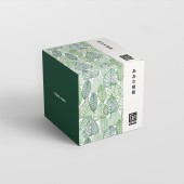
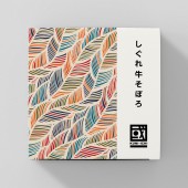
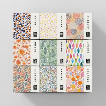
| DESIGN NAME: Kuniichi PRIMARY FUNCTION: Food Package INSPIRATION: Japanese food called Tsukudani (food boiled in soy sauce) is not popular among young people, so there was a problem that there were few opportunities to see it. So, I devised a package design that would give my interest to hands such as gifts like sweets, and it was brilliantly spread from the young generation to the elderly. UNIQUE PROPERTIES / PROJECT DESCRIPTION: It is a package design of Japanese traditional food (food boiled in soy sauce) and we aimed for a package that attracted viewers' interest in order to make it easier to purchase this product. A cubic shape that can be expressed richly and enjoyed by touching people. As a result, young people and the elderly have been chosen and new developments have been brought as gifts. And before developing the package, we started by creating a new logo first. We designed a logo to launch a new brand with a new naming. OPERATION / FLOW / INTERACTION: The problem was that the Japanese food Tsukudani (food boiled in soy sauce) was not very popular with younger generations. I wanted to make this Tsukudani easy for young people to touch like sweets. Thinking about purchasing as a gift or souvenir, and developing flavor variations with color and Illustration pattern combinations, young people were also hit and the set purchase was even more successful. PROJECT DURATION AND LOCATION: Started selling at department stores and shopping malls nationwide in 2019 as a new brand of a Tsukudani manufacturer in Mie, Japan. FITS BEST INTO CATEGORY: Packaging Design |
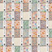
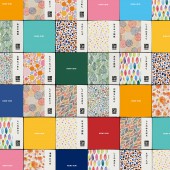
PRODUCTION / REALIZATION TECHNOLOGY: Designed to promote display and willingness to buy. When displaying products at stores, etc., a large number of products can be stacked, and the square design enables various display methods, so that products can be displayed freely and unified anywhere.The result was that people who saw the product show were attracted, and instead of buying one, they could buy three and six together. SPECIFICATIONS / TECHNICAL PROPERTIES: Size: High 75 x Wide75 x Depth75mm / Print: CMYK(350dpi) / Color variations: 9 variations TAGS: japanese, food, package, graphic, textile, pattern, illustration, colorful RESEARCH ABSTRACT: We anticipated that the variety of various flavors would increase, and verified the coloring and patterns suitable for the ingredients.It can be easily identified in the current product lineup, and it can respond to future additional lineups. CHALLENGE: In order to target products to a wide range of generations, we started by creating new logos first. I designed the logo for the launch of a new brand with a new naming from the company name. ADDED DATE: 2020-02-26 13:26:56 TEAM MEMBERS (1) : IMAGE CREDITS: Katsunari Shishido, 2019. |
||||
| Visit the following page to learn more: http://cocodoru.com/works/kuniichi-packa |
|||||
| AWARD DETAILS | |
 |
Kuniichi Food Package by Katsunari Shishido is Winner in Packaging Design Category, 2019 - 2020.· Read the interview with designer Katsunari Shishido for design Kuniichi here.· Press Members: Login or Register to request an exclusive interview with Katsunari Shishido. · Click here to register inorder to view the profile and other works by Katsunari Shishido. |
| SOCIAL |
| + Add to Likes / Favorites | Send to My Email | Comment | Testimonials | View Press-Release | Press Kit | Translations |
Did you like Katsunari Shishido's Packaging Design?
You will most likely enjoy other award winning packaging design as well.
Click here to view more Award Winning Packaging Design.


