Faberlic Supplements Packaging Concept by Dmitry Kultygin |
Home > Winners > #101178 |
 |
|
||||
| DESIGN DETAILS | |||||
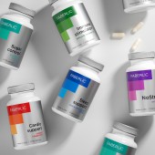
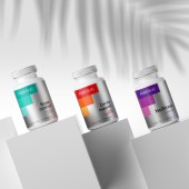
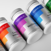
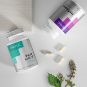
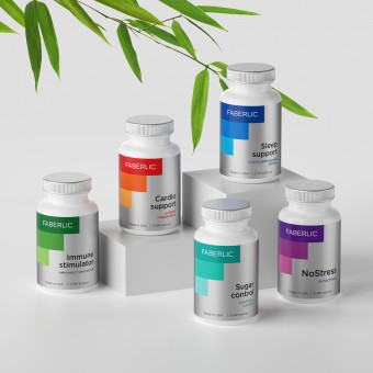
| DESIGN NAME: Faberlic Supplements PRIMARY FUNCTION: Packaging Concept INSPIRATION: The main metaphor of this project has become the diagram of improving the well-being of a person with the use of supplements. Also, the main graphic element repeats the shape of the letter F - the first letter in the brand name. UNIQUE PROPERTIES / PROJECT DESCRIPTION: In the modern world, people are constantly exposed to the aggressive effects of external negative factors. Bad ecology, the busy rhythm of life in megalopolises or stresses lead to increased loads on the body. To normalize and improve the functional state of the body, supplements are used. These are tools that help us take care of our health. OPERATION / FLOW / INTERACTION: Interaction with the end customer takes place on the pages of the corporate catalog and on the website. The design immediately explains the positive health effect of using the product. PROJECT DURATION AND LOCATION: The project started in August 2019 in Moscow and finished in February 2020 FITS BEST INTO CATEGORY: Packaging Design |
PRODUCTION / REALIZATION TECHNOLOGY: The main packaging is a plastic jar. The paper label is printed using offset printing. A Silver Pantone is used as the main background. SPECIFICATIONS / TECHNICAL PROPERTIES: Plastic jar. Shape - top down: cross section circular. Outside body diameter: 60.5 mm. Height (with the cap): 111 mm. Label size: height - 72.5 mm, width - 190 mm. TAGS: Supplements, Packaging, Health, Healthy Lifestyle, Jar, Care RESEARCH ABSTRACT: The main task in developing the design was to find a metaphor understandable to the consumer to explain the benefits of taking dietary supplements. This metaphor is a diagram that shows how your health will improve day by day. CHALLENGE: - ADDED DATE: 2020-02-26 11:28:26 TEAM MEMBERS (2) : Designer: Dmitry Kultygin and 3D visualization: Pavel Gubin IMAGE CREDITS: Dmitry Kultygin, 2019. |
||||
| Visit the following page to learn more: https://www.behance.net/Dmitry_Kultygin | |||||
| AWARD DETAILS | |
 |
Faberlic Supplements Packaging Concept by Dmitry Kultygin is Winner in Packaging Design Category, 2019 - 2020.· Read the interview with designer Dmitry Kultygin for design Faberlic Supplements here.· Press Members: Login or Register to request an exclusive interview with Dmitry Kultygin. · Click here to register inorder to view the profile and other works by Dmitry Kultygin. |
| SOCIAL |
| + Add to Likes / Favorites | Send to My Email | Comment | Testimonials | View Press-Release | Press Kit | Translations |
Did you like Dmitry Kultygin's Packaging Design?
You will most likely enjoy other award winning packaging design as well.
Click here to view more Award Winning Packaging Design.


