We Jewelry Retail Space by Fengfeng Chen |
Home > Winners > #101137 |
 |
|
||||
| DESIGN DETAILS | |||||
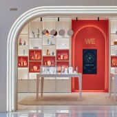
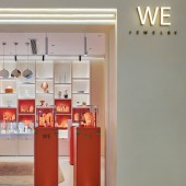
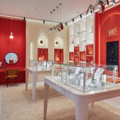
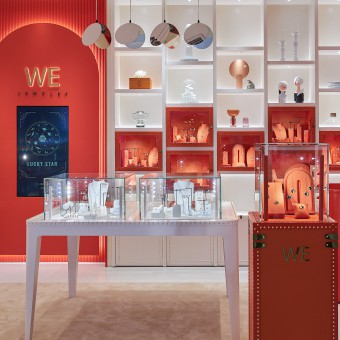
| DESIGN NAME: We Jewelry PRIMARY FUNCTION: Retail Space INSPIRATION: Busy life brings great pressure to people, produce from this to use travel case "the design inspiration that displays cabinet body for the theme, this element is integrated in" go shopping "in this kind of decompression way, formed a kind to let consumer place oneself in with" vacationing wind "in comfortable feelings. Classic element and metal rivet build brand characteristic. The design of metal rivets in the window and display cases reflects the noble feeling and delicacy of WE brand in details. UNIQUE PROPERTIES / PROJECT DESCRIPTION: The positioning and style of WE for the Finnish light luxury brand determine that this brand will be the trendsetter in the jewelry industry. While maintaining the original position of the brand, add fresh creativity and design. With the new concept to redefine fashion, evolution into modern, young, simple, trend of the spatial visual experience. From the raw material to the collocation to the choice of process, to the details of the carving. Step by step to create a sense of brand space vision. OPERATION / FLOW / INTERACTION: Orderly colour theme can give whole field with thematic bright, orderly visual effect and strong wallop. The theme color of this shop is burning orange, but rely on a kind of "anxious feeling" temperament route. The king of orange department, enter can attack retreat can defend, attune is lipstick to break goods king persimmon color, earth orange, pumpkin color, attune is classic temperament maple leaf brown, caramel color, warm coffee color. More refined than bright orange, but also romantic, warm, enthusiastic, retro, with a touch of showiness. PROJECT DURATION AND LOCATION: November 2019 / fuzhou city, fujian province, China FITS BEST INTO CATEGORY: Interior Space and Exhibition Design |
PRODUCTION / REALIZATION TECHNOLOGY: In order to present products and guiding customer experience, window elements into the design of grid, will be closed in the narrow space vision, with orange visual impact, guide customers in addition to other thoughts, immersed in a series of products of scene display daydream, make customers have rhythm, coordination and administrative levels, and target goods easily. Uniform arrangement of multiple grids, white for open grid, orange for closed grid, flexible distribution greatly enhanced the use of functional applications. SPECIFICATIONS / TECHNICAL PROPERTIES: The site area is 45 square meters TAGS: Jewelry retail space, jewelry, fashion, travel case showcase, display design RESEARCH ABSTRACT: Research jewelry display space form and the ratio of light design, different jewelry demand is different to the requirement of storefront and lighting, through the size of the shelves, materials and lights made in-depth understanding, elevation under the lights placed at the top of the front, make storefront jewelry reaches a certain brightness, front end also design the different color temperature of light source light, color temperature is 2700 k, 3000 k, 4500 k, 6000 k, with different colors more bright color temperature to make jewelry. CHALLENGE: WE mainly focuses on fast selling mode. In order to present jewelry in a limited space, WE embedded the display cabinet in the bookshelf, so that it can display more jewelry and satisfy the visual effect of decoration in the store. The combination of showcases and suitcase elements of all products, the classic elements of metal rivets to create brand characteristics. The design of metal rivets in the window and display cases reflects the noble feeling and delicacy of WE brand in details. ADDED DATE: 2020-02-26 10:02:18 TEAM MEMBERS (1) : Weng HuanLi IMAGE CREDITS: Image #1: Photografer Li Di, We Jewelry, 2019. Image #2: Photografer Li Di, We Jewelry, 2019. Image #3: Photografer Li Di, We Jewelry, 2019. Image #4: Photografer Li Di, We Jewelry, 2019. Image #5: Photografer Li Di, We Jewelry, 2019. PATENTS/COPYRIGHTS: For no |
||||
| Visit the following page to learn more: http://meikai.alteng.cn/ | |||||
| AWARD DETAILS | |
 |
We Jewelry Retail Space by Fengfeng Chen is Winner in Interior Space and Exhibition Design Category, 2019 - 2020.· Read the interview with designer Fengfeng Chen for design We Jewelry here.· Press Members: Login or Register to request an exclusive interview with Fengfeng Chen. · Click here to register inorder to view the profile and other works by Fengfeng Chen. |
| SOCIAL |
| + Add to Likes / Favorites | Send to My Email | Comment | Testimonials | View Press-Release | Press Kit |
Did you like Fengfeng Chen's Interior Design?
You will most likely enjoy other award winning interior design as well.
Click here to view more Award Winning Interior Design.


