Hopapops Healthy Snack Food by Angela Spindler |
Home > Winners > #101038 |
 |
|
||||
| DESIGN DETAILS | |||||
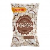
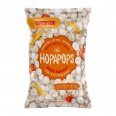
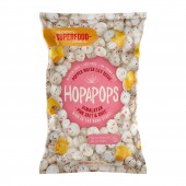
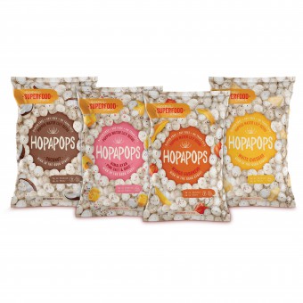
| DESIGN NAME: Hopapops PRIMARY FUNCTION: Healthy Snack Food INSPIRATION: The focal point of the packaging is the coloured circle in the middle, which houses the brand mark and all need-to-know info. The uneven nature of the typography lends a cheeky bounce, which complements the Hopapops brand name and fun tone of voice we created. The illustration, which makes up the main part of the packaging, drives home the flavour variant. A nutritionally dense product, gave reason to fill the entire face of the pack with product, and is a nod to how filling it is. UNIQUE PROPERTIES / PROJECT DESCRIPTION: The founders of this snack startup asked us to name, brand and package their version of popped water lily seeds, targeted at US consumers. The main challenge was how to grab a market that likely hasn’t even heard of eating the main ingredient, water lily seeds, at all? First up, we chose to focus on shelf shout, simple information hierarchy and strong ingredient visuals. OPERATION / FLOW / INTERACTION: This is a snack brand, the 1.oz version is designed for one while the 2.3 oz is designed as a family or share pack. PROJECT DURATION AND LOCATION: The projected commenced in March 2019, finished in September 2019. All work was generated in Sydney for a launch in the USA. FITS BEST INTO CATEGORY: Packaging Design |
PRODUCTION / REALIZATION TECHNOLOGY: Pouches produced digitally for initial short production run. Thereafter gravure. CMYK, plus x2 spot colours per pouch with Spot UV gloss SPECIFICATIONS / TECHNICAL PROPERTIES: Flow wrap packaging, digitally printed in US. Two pack sizes 1oz and 2.3 oz, printed CMYK. Offset versions printed CMYK, plus matt/spot UV Varnish. Material size 11 inches x 8 inches and 15 inches x 11 inches. 10 SKU's in total. TAGS: Superfood, Healthy Snack Packaging, Packaging, Pouch Packaging, Superfood Snack Food Packaging, Branding and Packaging, Logo Design, Illustration RESEARCH ABSTRACT: This product was relatively unknown so we decided to cover the entire pack with the product. We wanted consumers to understand the product's texture, shape and size immediately. We knew the target audience wanted flavour experiences and wanted to communicate seasoning rather than strong flavours hence the pieces of fruit/vegetable just poking through the puffed seeds. We developed a fun tone of voice for the brand while singing its health credentials. CHALLENGE: The timeline! We had to research, name and develop the brand / packaging and all the assets in 4 months ready for the product launch at a major US Trade Show. ADDED DATE: 2020-02-26 03:08:34 TEAM MEMBERS (3) : Angela Spindler - Creative Director/Designer, Anneke Decker - Finished Artist/Retoucher and Anna Makarova - Illustrator IMAGE CREDITS: Illustrator: Anna Makarova |
||||
| Visit the following page to learn more: https://www.wearedepot.com.au/portfolio/ |
|||||
| AWARD DETAILS | |
 |
Hopapops Healthy Snack Food by Angela Spindler is Winner in Packaging Design Category, 2019 - 2020.· Read the interview with designer Angela Spindler for design Hopapops here.· Press Members: Login or Register to request an exclusive interview with Angela Spindler. · Click here to register inorder to view the profile and other works by Angela Spindler. |
| SOCIAL |
| + Add to Likes / Favorites | Send to My Email | Comment | Testimonials | View Press-Release | Press Kit | Translations |
| COMMENTS | ||||||||||||
|
||||||||||||
Did you like Angela Spindler's Packaging Design?
You will most likely enjoy other award winning packaging design as well.
Click here to view more Award Winning Packaging Design.


