Luhua Xiaomo Sesame Oil by Tiger Pan |
Home > Winners > #100810 |
 |
|
||||
| DESIGN DETAILS | |||||
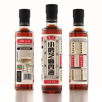
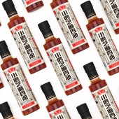
| DESIGN NAME: Luhua Xiaomo PRIMARY FUNCTION: Sesame Oil INSPIRATION: The bottle is minimized into a straight round one, while the label is designed into a newspaper, inspired by a childhood memory. The newspaper-wrapped bottle builds up a natural emotional connection with consumers as it reminds them of the old times and the premium quality. The layout is inspired by Chinese old signages of street shop where characters were put straight down with an attempt to convey that the brand is authentic and traceable. UNIQUE PROPERTIES / PROJECT DESCRIPTION: In 1980s, we wrapped snacks and seasoning stuff with newspaper. It was a period when food was not always available yet precious. Luhua Group is the biggest sesame oil producer. Different from normal sesame oil, the grinding sesame oil is hand-making, with less output but much more fragrant. OPERATION / FLOW / INTERACTION: By creating the cylindrical bottle for Luhua, we have also brought forth a different choice to the condiment market in China and the neat bottle of sesame oil is now standing out from its competitors. With this widely consumed product, Luhua not only upgrades its own branding image, but also draws common people's attention to aesthetic orientation in consumption activities. PROJECT DURATION AND LOCATION: The project was done within 2 months. The design is finished in Shenzhen, production in Laiyang City, Shandong Province. FITS BEST INTO CATEGORY: Packaging Design |
PRODUCTION / REALIZATION TECHNOLOGY: We reshaped the bottle with glass which is quite different with the all condiments in China. People are more like holding a roll of newspaper than a bottle for its cylindrical shape. SPECIFICATIONS / TECHNICAL PROPERTIES: Diameter 50mm,Height 210mm, Glass Bottle with 350 degrees adhesive label. TAGS: Bottle, Sesame Oil, Luhua, Grinding Sesame Oil, High End. RESEARCH ABSTRACT: All Chinese condiments brand concentrated in how to improve the taste of their product but overlooked the importance of product packaging over past 4 decades. The quality of Luhua's products is undoubtedly the best in China, but the package is still outdated just like all condiments packaging in market, all bottle are exactly the same. We redesigned all information with old Chinese newspaper’s layout, so that the product name can be seen as soon as possible. CHALLENGE: When manufactured, the label are not able to cover the bottle in 360 degree. Yet, the gap uncovered is turned into an embossed steelyard's mark, where consumers can see the amount. The production technique of this sesame oil is advanced so it is no longer neglected but emphasized in this newspaper-like layout. All characters are placed in order, complying relative laws and regulations. ADDED DATE: 2020-02-25 12:57:42 TEAM MEMBERS (3) : Designer: Tiger Pan, Qian Chi, Picture Credits: Kelin Tan and Technicion: Zhangkun Xie IMAGE CREDITS: Tiger Pan, 2019. |
||||
| Visit the following page to learn more: http://www.tigerpan.com | |||||
| AWARD DETAILS | |
 |
Luhua Xiaomo Sesame Oil by Tiger Pan is Winner in Packaging Design Category, 2019 - 2020.· Read the interview with designer Tiger Pan for design Luhua Xiaomo here.· Press Members: Login or Register to request an exclusive interview with Tiger Pan. · Click here to register inorder to view the profile and other works by Tiger Pan. |
| SOCIAL |
| + Add to Likes / Favorites | Send to My Email | Comment | Testimonials | View Press-Release | Press Kit |
Did you like Tiger Pan's Packaging Design?
You will most likely enjoy other award winning packaging design as well.
Click here to view more Award Winning Packaging Design.


