DESIGN NAME: Meet Fun
PRIMARY FUNCTION: Commercial
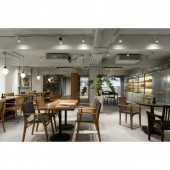
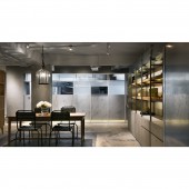
INSPIRATION: Upon the healthy and natural principles of the client, the design team created a bright and spacious Italian-style restaurant with clean lines, open visual effect, and a warm space atmosphere. In order to integrate the interior facade and the surrounding streetscape landscape, during the early stage of planning has established a continuous communication to sort out the expectation of the ideal commercial space.
UNIQUE PROPERTIES / PROJECT DESCRIPTION: The materials used in the construction process of this project were originally collected by the clients family, the design team newly transformed them to create a bright and comfortable dining environment by reusing old things. In addition, aims to integrate the project and the local streetscape. While emphasizing the characteristic of the brand, it also displays the cultural characteristics of the surrounding area in a manner that respects the locality.
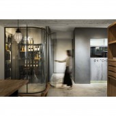
OPERATION / FLOW / INTERACTION: In order to effectively utilize the spacious space of the site and create an open and bright visual experience, the design team re adjusted the position of the kitchen and bathroom, reducing the negative space, overcoming the flaws of floors, and enhanced the comfort of the dining environment. Since the materials used in the construction process are the clients collections, there are certain restrictions on the materials. In the entire planning, needs to achieve environmental protection goals and reuse the resources through precise calculations.
PROJECT DURATION AND LOCATION: The project finished in March, 2019 in Taipei, Taiwan.
FITS BEST INTO CATEGORY: Interior Space and Exhibition Design
|
PRODUCTION / REALIZATION TECHNOLOGY: Concrete finish, Fair-faced concrete, Oak wood, Old tiles, Steel plates, Wooden tables, Leather seats.
SPECIFICATIONS / TECHNICAL PROPERTIES: The floor area is about 330 square meters, and the layout is divided into bar area, dining area, kitchen, and storage room.
TAGS: Old house renovation, commercial space, soft and hard materials, Fair-faced concrete, Fresh and natural, Transparent
RESEARCH ABSTRACT: Because the client expects to convey a healthy and high quality dining culture through this space, the design team created a simple and bright dining environment by integrating elements of the site surrounding environment with modern and simple design techniques. The overall space planning improves the flaws of the original site by providing open view, clean and simple color tone, clean lines, and a natural and comfortable environment; which satisfied the clients expectations.
CHALLENGE: The site has more than 40 years history, the low ceiling height, limited building materials, and the specification of the building management committee are the difficulties that the design team encountered during the construction process. However, since was patiently looking for the suitable materials and successfully overcoming these restrictions one by one, this modern Italian restaurant is presented in a simple and bright style.
ADDED DATE: 2020-02-25 11:43:50
TEAM MEMBERS (3) : Shih-Ming Liu, Cheng-Ham Lin and Shih-Ming Lo
IMAGE CREDITS: MD Pursuit
|